zak
The Living Force
“We think that if we look at something enough, especially if we have to pay attention to its shape as we do during reading, then we would know what it looks like,” Johns Hopkins cognitive scientist Michael McCloskey, the study’s senior author, said in a news release. “But our results suggest that's not always the case".
There's One Letter In The Alphabet That Almost No One Can Write | HuffPost
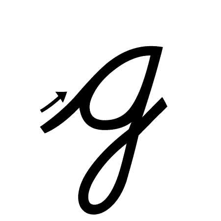
http://psycnet.apa.org/record/2018-13691-001Knowledge of letter shapes is central to reading. In experiments focusing primarily on a single letter shape—the “looptail” lowercase print G—we found surprising gaps in skilled readers’ knowledge. In Experiment 1 most participants failed to recall the existence of looptail g when asked if G has two lowercase print forms, and almost none were able to write looptail g accurately. In Experiment 2 participants searched for Gs in text with multiple looptail gs. Asked immediately thereafter to write the g form they had seen, half the participants produced an “opentail” g (the typical handwritten form), and only one wrote looptail g accurately. In Experiment 3 participants performed poorly in discriminating looptail g from distractors with important features mislocated or misoriented. These results have implications for understanding types of knowledge about letters, and how this knowledge is acquired. For example, our findings speak to hypotheses concerning the role of writing in learning letter shapes. More generally, our findings raise questions about the conditions under which massive exposure does, and does not, yield detailed, accurate, accessible knowledge. In this context we relate our findings to studies showing poor knowledge or memory for various types of stimuli despite extensive exposure. (PsycINFO Database Record (c) 2018 APA, all rights reserved)


")