Color perception

She wonders if women are more likely to be able to see through the filter?
No :-D At least I didn´t saw the original color.....

I wonder, what does your wife see on this one? I see gold on the outer parts of the flip-flop with golden stripes and light blue in the middle......
So - gold/light blue
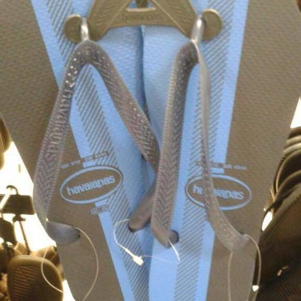
image.jpg


It keeps changing for me throughout the day if I see pink/white or gray/teal. And the difference is often very pronounced. Sometimes I can hardly imagine to see the other variation at that point and sometimes it's less pronounced and I can kind of fade between the versions. At one day I saw it in one version mostly throughout the day and after taking a shower and coming back fresh with nothing on my mind and no expectations it had completely switched to the other version (I don't remember which way round it was before/after).

Could there be any difference between genders? Maybe men are more comfortable with seeing gray/blue, and women more with pink/white?

I also think (or rather feel) that a pink/white sports shoe makes totally sense and isn't something unusual to see, and gray/teal one is a bit less usual. So I wonder how or if it would work with any object or with abstract images.
I created some 'unshoed' versions that are pixelated so the brain doesn't see a real 'thing' anymore with any associations(?). I can't test it now because I just see gray/teal currently but I will check from time to time, with the pixelated version first, if I can ever see that one as pink/white. I'm using spoilers so you can open/close them individually:

tmp_unshoed_0.02_10x11.jpg
tmp_unshoed_0.04_19x21.jpg
tmp_unshoed_0.06_28x30.jpg
tmp_unshoed_0.08_37x40.jpg
tmp_unshoed.jpg


The flipflops are gray/blue :-D
 
OK, where do you see gray, and where do you see blue?
The inner edges of the sole are light blue, the outer ones gray (which you described as gold) with maybe a tiny bit of dirty or golden tone but not really. There is way more of a brownish/golden tone in the bottom left background and in the triangle they are hanging at at the top. The rubber bands in the front are a bit more silver gray. On the other actual product image behind the link, the outer edges are more dark blue or bluish black than gray and the rubber band more dark blue than silver.
 
The inner edges of the sole are light blue, the outer ones gray (which you described as gold)
I see them the same way; gray/blue.

I also see that dress that's supposed to be blue/black in the sunny picture and gray/maroon. Main body is gray, the stripes are maroon. In the shade, I can see the white/gold (more orange to me).

And, now when I look at the first picture Joe showed of the shoe that I had seen as pink/white, I see gray/aqua. If I stare at it and concentrate, I can get it back to pink/white, but it returns to the gray/aqua. :umm:
 
the outer ones gray (which you described as gold) with maybe a tiny bit of dirty or golden tone but not really.
I see them the same way; gray/blue.

That´s interesting! I don´t see any shade of gray in the flip-flops whatsoever.... :umm:
The rubber bands are to me more some sand-gold (shiny).
And outer part is some beige-gold (mat) color.
So overall - warm colors, but I don´t see any trace of gray (cold) in it.

At least we agree on light blue part! :-D
 
We both see gold and light blue. She said gold and white at first, but then said she could see a very light baby blue.
I thought so... :-D

In the first shoe picture, some people might actually see the real pink/white color because the rest of the picture is dark and in a kind of a shadow, so probably some persons brains have meanings to compensate for that (see trough the filter) and to see actual pink/white color instead of gray/aquamarine.

Here with flip-flops, the background is more bright, like it gives impression of the daylight photo. And that could "trick" the brain that there are no filters on the shown object.
So, it (kinda) makes sense that we see the flip-flops as golden/white or golden/light blue - just because of the bright background, our brain interprets the object´s colors as real.

So having that said, what I´m confused, or better, stunned about is - how in hell others see gray where we see gold(ish)? :huh:

I really doubt it has to do with the monitor/display this time... :-D
 
I think it's important to know what we perceive vs. what actually is. And it may be helpful to switch between the two. The resolution image posted above shows that the higher the resolution, the more information. Clearly those pixels lean towards bluegreen, while others are more gray. But when you add more pixels it can be interpreted differently. Add more context/resolution to see the hand and surroundings which have a filter, and you can then better infer what the actual colors are. So you can take that further and ask what else are we missing because of our tunnel vision (and other senses)?

For the flip flops I see a muddy gray color that leans warm or gold colored on the outside, a purple gray on the straps, the hanger a more saturated gold-gray, and light blue stripes on the inside.

The dress images with different lighting surroundings helps me see the difference. I wonder if the actual time of one's viewing of the images affects the perception of the colors? Or even the ambient light in the room where you're viewing them?
 
I'm wondering if the band of specific colors used, both the filtered picture as well as the original, create this effect for some. I'm not sure if the filtered photo can be separated from the original. Some brains might pick up on a blueish tint on what it thinks should be white laces and adjust from there? Interestingly, the shade of 'blue' on the laces has its inverse color as pinkish red. Since the brain perceives blue light in a unique way from other colors, perhaps there might be some mechanism going on in the brain that would create a 'correction'?
 
The following isn't directly connected to color perception (and maybe it does, who knows), but there is this curious "colors timeline".

And I wonder why and what changed?

For hundreds of years until the beginning of the 20th century, the distribution of the most popular colors used in painting art hasn’t been changed significantly. But starting from the 20th-century colors, primarily used in painting artworks of that time, changed noticeably. This is how the chronology of the most popular painting colors evolves over the years.

About & How To Read: The visualization above shows 10 most popular colors of each decade since 1500. For a given decade only 50 paintings were randomly sampled and 10 most prevalent colors were detected using machine learning clustering algorithm.

1.jpg
2.jpg
 
And I wonder why and what changed?
I found the brighter colors during the maunder minimum interesting. It makes sense that people paint differently when life sucks (or when there is less sunlight). FWIW, I aligned the color timeline with solar activity (from wikipedia Maunder Minimum). It seems the colors are brighter during lows and peaks, or in other words, around the times of changes.
maunder_colors.jpg
 
Back
Top Bottom