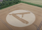
Being a “Star Trek” fan, seeing the outer ring of symbols,
My first thought was Klingon. 
Thank you both for your reply’s.
Klingon looks like a cuneiform derivative mixed with Kanji sourcing. Latter is probably some artists' favorite. ;)
Kanji are the logographic Chinese characters taken from the Chinese script used in the writing of Japanese.
Best inspiring Kanji is of course
bold calligraphic hand writing, which looks
more art than writing.
When
artists try to create some runes / writing they might end up the same as
Disney's Atlantean letters, which a good technical example of function and cohesion.
Additional example:
Look at this
Japanese Calligraphy inspiration from the movies.
I was looking at those and while listening to music, had the intent that I must create something that looks this cool, but also can be accepted as "magic runes". For my magnum opus. This was the result and you can see its still very limited in scope:

..compared to the amazing LETTERING ART on the
above crop circle image
Apparently I am not the only one, who thinks
these symbols are totally cool:
This is assuming that the circle makers had a specific concept for each glyph. If you know who they are, please ask them to contact me. (I would respect their anonymity). Their work on this circle astonishes me, and I would love to know their thoughts and methods.
Look like pictographic writing developed to a high degree on an alien world.
If real, that's alien writing. Waay to elaborate, seems eloquent. These symbols might be intended to convey lots of info, were designed to express much more complex, higher level of thought, I think. Haven't seen anything like it on Earth.
Trying to find something similar:
Modern Chinese is very similar to Khitan.
Old Chinese looks way more primitive cuneiform/pictographic.
Oldest remaining
Neolithic Chinese 5000 BC pot-marks may look interesting art-designs, but as symbols/writing they are hopeless against the signs on above crop circle.
Chinese cursive is a mess.. Obviously the much too picturesque hieroglyph styles (A) do not match. Even
the Rosetta stone (B) has
humanized writing, just compare the two.
Sanskrit is different, like a tamed, simplified, well oiled script of a well running Obyvatel-school of thought & organization. Definitely
not Sumerian.
Here is
Greek compared to Egyptian. Nope..
BTW:
Hungarian cuneiform also surprisingly translates to Egyptian, there was a Hungarian scientist, who published a paper decoding Egyptian using Hungarian cuneiform.
..(still searching for anything comparable to above
crop circle "letters", using remains of written languages)..
Not
old Turkic script.
Below pic is like kindergarten stuff compared to
that above crop circle.
Table showing the evolution of
hieroglyphic signs (left) through several stages of
hieratic into
demotic (right)
As you can see, this above is clearly the writing of Human Slaves on Earth. Proof of Lizzie thoroughness in destroying civilizations and allowing only societies, who keep to stupid.
The difference feels apparent to me in the expression of "the shallow depth of thought". Above pic is like coming from workers on a Lizzie slave plantation - necessitating only warehouse management and simple religion -, mind-control mechanisms, human-barnyards, which the old cultures probably were forced to become.
Mayan Codex is incomparable, sans the repeating dots. :)
Indus River Valley script looks like as if a Neanderthal tried to learn to write..
Even what looks like
Cursive Greek LINEAR B (
source article) is easy to see that its waay too simplistic, feels "naive".
Kudos to
Byzantine cursive, but
no cigar!
Proto-Elamite? No chance!
Old Korean: Silla or before it
hyangga looks very much like Japanese. No chance.
Depends on what you look at, when you create symbols:
So I think if an artist smokes a bong or takes cannabis or any drug that causes visions, while the artist is still able to draw, then essentially
the drug-induced visions are the reference! An artist needs to LOOK at something as a reference to create his drawings.
It could be that the drug induced visions will show Lizard-style patterns, writings, geometric configurations etc.. and the artist is looking at these images produced / received in his mind and creates "something similar".. Just look at, what the Disney artist and I created.
That could explain, how those amazingly done marks ended up in a crop circle. The
motherships-bong artist might have been inspired by a 4thD STS source. While he/she could clearly receive / see the patterns inside the circle, reproducing those alien (Lizzie?) letters was apparently way too much for him.
The letters could be Lizard-signs in Lizzie-Lingo. That "four dotted scorpions tail" definitely repeats and could be a coin-engraving separator, Only in the supposedly super-complex Lizard language it could mean:
- All hail the Great Lizard God,
Ormethion!


