You are using an out of date browser. It may not display this or other websites correctly.
You should upgrade or use an alternative browser.
You should upgrade or use an alternative browser.
Near-Earth objects and close calls
- Thread starter Gawan
- Start date
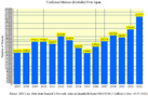
2020 is another all-time record year!
Another year has passed. As it turns out, 2021 (again) beats the previous all-time records of 2020 in pretty much all departments. For this year, I've revised/recalculated and double-checked all the data, and I am currently in the process of extracting more information out of the data. This time around, I won't explain things in detail. You can read the description of the previous year here, for a rough reference on how to read the data and graphs that follow below. I'm still working on the new Database for 2021, and what you will see below is a selection out of that Database. I'll let you know when the Database is finished so that you can use it too and have a look at everything. As you will see, I've also redone all the graphs, trying to put as much information in it as possible, in order to explain the extent of what is going on and in the hopes of bringing what is going on across without the need for wordy explanations. Also, while redoing the database, a number of new ideas I haven't thought about came to mind. Thus, you will also see new graphs and charts. The database will likely also have a new folder in which new (quite interesting) data/graphs will be added. Again, we will zoom in from the father reaches of the solar system (farther away from earth) and finally we land on earth itself (fireballs). So here we go...
A NEO is defined as:
In terms of orbital elements, NEOs are asteroids and comets with perihelion distance q less than 1.3 au.
The astronomical unit (symbol: au, or au or AU) is a unit of length, roughly the distance from Earth to the Sun and equal to about 150 million kilometres (93 million miles) or ~8 light minutes
So, 1.3 au equals roughly the distance of = 194.5 million kilometers (121 million miles)
Notice that from 1900 to 1999 the data was counted in decades followed by year counts since the year 2000! Which means that the increase compared to the 1900 - 1999 year periods is actually much, much higher than is expressed in this graph!:
The same applies for the following two graphs, which are extracted from the above graph/data:
Zooming in....
A NEO that has come closer to earth than the moon is defined by a distance less than 1 LD (Lunar Distance) from earth:

What follows, is the exact same data from the above graph in more detail. Take a very close look. It is looking bad. Only the green portions might be considered "safe" (assuming we could do anything against them). They just fly by without anyone really being able to do anything about it! The majority comes in, and we didn't see it coming, while the overwhelming majority doesn't look much better either.

Which again translates into the following; a 98.68% reality that we are screwed against such NEO's:

And here we take a look at the complete discovery history of such objects (until the end 2021). The first object of that kind was discovered in 1991, as you can see:

And just for fun, we take a look at the size distribution of those objects:

A NEO that has come closer to earth than the moon is defined by a distance less than 1 LD (Lunar Distance) from earth:
Lunar distance (astronomy)
The instantaneous Earth–Moon distance, or distance to the Moon, is the distance from the center of Earth to the center of the Moon. Lunar distance (LD or {\textstyle \Delta _{\oplus L}}), or Earth–Moon characteristic distance, is a unit of measure in astronomy. More technically, it is the semi-major axis of the geocentric lunar orbit. The lunar distance is approximately 400,000 km, which is a quarter of a million miles or 1.28 light-seconds. This is roughly thirty times Earth's diameter. A little less than 400 Lunar distances make up an astronomical unit.
What follows, is the exact same data from the above graph in more detail. Take a very close look. It is looking bad. Only the green portions might be considered "safe" (assuming we could do anything against them). They just fly by without anyone really being able to do anything about it! The majority comes in, and we didn't see it coming, while the overwhelming majority doesn't look much better either.
Which again translates into the following; a 98.68% reality that we are screwed against such NEO's:
And here we take a look at the complete discovery history of such objects (until the end 2021). The first object of that kind was discovered in 1991, as you can see:
And just for fun, we take a look at the size distribution of those objects:
Last edited:
Zooming in.... into earths atmosphere.
A fireball is defined as:


And the same data expressed in numbers:

Japan Fireball Data:

And the same data expressed in numbers:

Edit: [21.05.2022] Japan Fireball Data added: Note that the source of the Fireball Datasets from Japan have changed compared to the previous years and I'm not 100% certain that the above data actually represents the confirmed meteors anymore since they scrubbed that term for those numbers. Considering though that those numbers correspond quite closely to the numbers of the previous years I suspect that those still represent the confirmed Meteors and that they just didn't label them as such anymore.
A fireball is defined as:
Fireballs and bolides are astronomical terms for exceptionally bright meteors that are spectacular enough to to be seen over a very wide area. ... A fireball is an unusually bright meteor that reaches a visual magnitude of -3 or brighter when seen at the observer's zenith.
And the same data expressed in numbers:
Japan Fireball Data:
And the same data expressed in numbers:
Edit: [21.05.2022] Japan Fireball Data added: Note that the source of the Fireball Datasets from Japan have changed compared to the previous years and I'm not 100% certain that the above data actually represents the confirmed meteors anymore since they scrubbed that term for those numbers. Considering though that those numbers correspond quite closely to the numbers of the previous years I suspect that those still represent the confirmed Meteors and that they just didn't label them as such anymore.
Attachments

Last edited:
Huge meteorite in Pakistan.
The people of Karachi and Hyderabad saw it on Saturday. It was on green light.
The people of Karachi and Hyderabad saw it on Saturday. It was on green light.
A bright meteor was seen crossing the skies of Northern Italy in the early morning of 2nd February.
The fireball was captured by 2 cameras in Corsica at an altitude of 80km before crossing the Tuscan archipelago in a south-easterly direction as seen by multiple cameras of the Prisma network that belongs to the National Institute of Astrophysics (Inaf).
The meteor was even detected by three Catalan and Valencian sensors in Spain.
Link to the Italian Sputnik article
I am currently in the process of extracting more information out of the data
If possible, I would like to ask for some help/opinions/feedback or guidance from people more or less versed or knowledgeable in statistics/mathematics and/or how to check for a valid scientific comparison of curve shapes in graphs between different sets of data.
I would like you to have a closer look at the course of the curves (curve shape/waveform) of the following 3 graphs and compare them to each other. Especially the first graph with the last graph:
A NEO is defined as:
In terms of orbital elements, NEOs are asteroids and comets with perihelion distance q less than 1.3 au.
The astronomical unit (symbol: au, or au or AU) is a unit of length, roughly the distance from Earth to the Sun and equal to about 150 million kilometres (93 million miles) or ~8 light minutes
So, 1.3 au equals roughly the distance of = 194.5 million kilometers (121 million miles)
[...]

[...]
Zooming in....
A NEO that has come closer to earth than the moon is defined by a distance less than 1 LD (Lunar Distance) from earth:
Lunar distance (astronomy)
The instantaneous Earth–Moon distance, or distance to the Moon, is the distance from the center of Earth to the center of the Moon. Lunar distance (LD or {\textstyle \Delta _{\oplus L}}), or Earth–Moon characteristic distance, is a unit of measure in astronomy. More technically, it is the semi-major axis of the geocentric lunar orbit. The lunar distance is approximately 400,000 km, which is a quarter of a million miles or 1.28 light-seconds. This is roughly thirty times Earth's diameter. A little less than 400 Lunar distances make up an astronomical unit.
[...]
Zooming in.... into earths atmosphere.
A fireball is defined as:
Fireballs and bolides are astronomical terms for exceptionally bright meteors that are spectacular enough to to be seen over a very wide area. ... A fireball is an unusually bright meteor that reaches a visual magnitude of -3 or brighter when seen at the observer's zenith.
[...]
Is it just me, or are the curve shapes looking strikingly similar (especially the first and the third one)? Here are the same three graphs put into one graph + the date of discovery of every NEO closer than the moon, but this time expressed in a line chart. I excluded the distorting data at the beginning (because it was counted in decades there) to get a more accurate picture of the line curves:
As a layperson, the above graph seems to be still a bit misleading to me since the four different curves have 4 different scales? Because I tried to put those four different scales into one graph? That's why the green and black lines look very different, to the red and blue ones, I would say? See below for how I'm currently thinking it should be compared instead. Anyway, the two lines above (red and blue) are close enough to each other in scale (but still a bit distorted against each other?) that I can illustrate what I mean by putting in vertical black lines and a couple of arrows:
It seems to me that within the vertical black lines, the curve shapes and the curse of the curves are practically almost exactly the same? And even in the part marked by the arrows, although seemingly a bit different, the general shape is almost the same as well? And in the non marked part there also could be a similarity, although much less obvious/concrete? And the overall shapes from beginning to end are also pretty similar?
So, is this a valid comparison between the two lines/data sets? If so, how can this be explained when the blue line represents all discovered NEOs in each year and the red curve represents all confirmed Fireballs over the USA? How could this possibly be explained by any other way than that there might be direct correlation between the two lines (data)? And what is that correlation? An actual increase of such objects in the solar system around us, right down to earths atmosphere, rather than the argument that this must be due to "improved technology" or "more telescopes/people/satellites looking" for it? I mean, how likely is it that this striking similarity between the two lines can be explained by "improved technology" or "more telescopes/people/satellites looking" when you consider the fact that Fireballs are very easily noticed on earth with our own eyes alone, while to find/see NEOs it is comparable to try to find a Needle in a Haystack (a very, very, very strong understatement!)?
So, could the above be one of the first actual solid evidence pieces (if not the only one, as of now) that there is a good likelihood that what the C's have told us (that a comet cluster is coming in) is what is happening there? Could it also be one of the first actual solid evidence pieces that quite clearly goes against the argument of it being due to "improved technology" or "more telescopes/people/satellites looking"?
Anyhow, now here are the four lines in the above graph individually within their own scales. I'm assuming that comparing the following four lines/curves with each other in some way (in how they look below) is the most accurate way of comparing the four curves between each other? If so, how could I do that exactly to be statistically/scientifically correct? Would I need to overlay (superimpose) the four curves as they are represented below? If so, how?
I also tried to represent the four curves above in 4 different cumulative charts instead. Maybe that is a better (or more accurate) way for comparison? If wanted/needed, I could post those results here too. As of now, though, the cumulative approach doesn't seem to be the right one, as far as I can see.
PS: 08.02.2022 = Corrected the Curve Shape Charts since I put in wrong sources and found other writing mistakes. Corrected now.
Last edited:
Users on social networks captured the early hours of this Sunday, February 6, the fall of a supposed meteorite that could be seen in Sinaloa and Baja California Sur, in northern Mexico.
Videos shared on social media show a fragmented luminous object falling from the sky. It is not yet known if the sighting was a meteorite or space debris
The recordings were captured by citizens of Los Cabos, La Paz and Culiacán, who while carrying out different activities, the supposed meteorite was descending from the heights. So far there is no report from authorities confirming what it was and where the space rock impacted.
Users on social networks captured the early hours of this Sunday, February 6, the fall of a supposed meteorite that could be seen in Sinaloa and Baja California Sur, in northern Mexico.
Videos shared on social media show a fragmented luminous object falling from the sky. It is not yet known if the sighting was a meteorite or space debris
The recordings were captured by citizens of Los Cabos, La Paz and Culiacán, who while carrying out different activities, the supposed meteorite was descending from the heights. So far there is no report from authorities confirming what it was and where the space rock impacted.
Frintera Espacial on Twitter says it was a "SpaceX rocket"
move on move on nothing to see here.
I might be able to help. You have a time series of data here which could be easily be modelled and then you can compare the coefficients of the models. I don’t understand exactly what you want to compare but I have not yet read through all the posts above. I have an exam to study for this week—as it happens on Regression modelling. Next week I can look through your data properly.If possible, I would like to ask for some help/opinions/feedback or guidance from people more or less versed or knowledgeable in statistics/mathematics and/or how to check for a valid scientific comparison of curve shapes in graphs between different sets of data.
I would like you to have a closer look at the course of the curves (curve shape/waveform) of the following 3 graphs and compare them to each other. Especially the first graph with the last graph:
Is it just me, or are the curve shapes looking strikingly similar (especially the first and the third one)? Here are the same three graphs put into one graph + the date of discovery of every NEO closer than the moon, but this time expressed in a line chart. I excluded the distorting data at the beginning (because it was counted in decades there) to get a more accurate picture of the line curves:
View attachment 54534
As a layperson, the above graph seems to be still a bit misleading to me since the four different curves have 4 different scales? Because I tried to put those four different scales into one graph? That's why the green and black lines look very different, to the red and blue ones, I would say? See below for how I'm currently thinking it should be compared instead. Anyway, the two lines above (red and blue) are close enough to each other in scale (but still a bit distorted against each other?) that I can illustrate what I mean by putting in vertical black lines and a couple of arrows:
View attachment 54526
It seems to me that within the vertical black lines, the curve shapes and the curse of the curves are practically almost exactly the same? And even in the part marked by the arrows, although seemingly a bit different, the general shape is almost the same as well? And in the non marked part there also could be a similarity, although much less obvious/concrete? And the overall shapes from beginning to end are also pretty similar?
So, is this a valid comparison between the two lines/data sets? If so, how can this be explained when the blue line represents all discovered NEOs in each year and the red curve represents all confirmed Fireballs over the USA? How could this possibly be explained by any other way than that there might be direct correlation between the two lines (data)? And what is that correlation? An actual increase of such objects in the solar system around us, right down to earths atmosphere, rather than the argument that this must be due to "improved technology" or "more telescopes/people/satellites looking" for it? I mean, how likely is it that this striking similarity between the two lines can be explained by "improved technology" or "more telescopes/people/satellites looking" when you consider the fact that Fireballs are very easily noticed on earth with our own eyes alone, while to find/see NEOs it is comparable to try to find a Needle in a Haystack (a very, very, very strong understatement!)?
So, could the above be one of the first actual solid evidence pieces (if not the only one, as of now) that there is a good likelihood that what the C's have told us (that a comet cluster is coming in) is what is happening there? Could it also be one of the first actual solid evidence pieces that quite clearly goes against the argument of it being due to "improved technology" or "more telescopes/people/satellites looking"?
Anyhow, now here are the four lines in the above graph individually within their own scales. I'm assuming that comparing the following four lines/curves with each other in some way (in how they look below) is the most accurate way of comparing the four curves between each other? If so, how could I do that exactly to be statistically/scientifically correct? Would need to overlay (superimpose) the four lies as they presented below? If so, how?
View attachment 54535
View attachment 54536
View attachment 54537
View attachment 54538
I also tried to represent the four lines above in 4 different cumulative charts instead. Maybe that is a better (or more accurate) way for comparison? If wanted/needed, I could post those results here too. As of now, though, the cumulative approach doesn't seem to be the right one, as far as I can see.
Or are you already way ahead of me?
@Cosmos , what you have done here can be called exploratory data analysis, where you start by visualising the data to inspect it and see what it might be able to tell you. Next step as you have pointed out is to apply some modelling and statistical tests.I might be able to help. You have a time series of data here which could be easily be modelled and then you can compare the coefficients of the models. I don’t understand exactly what you want to compare but I have not yet read through all the posts above. I have an exam to study for this week—as it happens on Regression modelling. Next week I can look through your data properly.
Or are you already way ahead of me?
I might be able to help. You have a time series of data here which could be easily be modelled and then you can compare the coefficients of the models. I don’t understand exactly what you want to compare but I have not yet read through all the posts above. I have an exam to study for this week—as it happens on Regression modelling. Next week I can look through your data properly.
That would be very nice and I would be very interested!
It would also be nice if you could explain here roughly what you are trying to do and what can be gathered out of this analysis. I would like to understand it (at least roughly).
For now I would be primarily interested in comparing „Curve Shape 1“ with „Curve Shape 2“ and maybe add „Curve Shape 3“ and/or „Curve Shape 4“ (see my last post above).
If you need more info, or want me to make things clearer, feel free to ask!
@Cosmos , what you have done here can be called exploratory data analysis, where you start by visualising the data to inspect it and see what it might be able to tell you. Next step as you have pointed out is to apply some modelling and statistical tests.
Sounds exactly like what I‘m looking for. Seems like you could help a lot with your expertise! I also thought that some statistical tests must be done there. It might provide some interesting results (or not).
Trending content
-

-

-
Thread 'Coronavirus Pandemic: Apocalypse Now! Or exaggerated scare story?'
- wanderingthomas
Replies: 30K -
