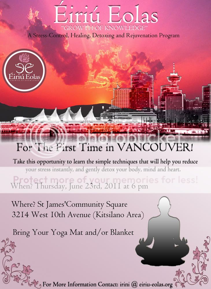
Aya said:
I would just like to chime in to say:
Wow Deedlet, it looks really nice!! ;D
I agree, it's great Deedlet, well done!

Aya said:
I think you can move the words little bit down. I think it will look better in balance.
I agree with this. Also, a couple of other little things:
- between the words "St Jame's Community" a space is missing.
- if we divide this line in two "A stress-control, healing, detoxing and rejuvenation program", like
A stress-control, healing,
detoxing and rejuvenation program
all fonts will be in the lighter part of the sky so they can read clearer in the print out.
- From where it says "For the first time..." until "...mind and heart", the fonts look a bit fuzzy, and might not look very clear in the printout version.
- can we use the same poster for the flyers in a quarter of a page size? Getting four flyers out of a letter size paper kind of thing.
Other than that, you can send me the finals and i'll start printing :)
Anyone in Vancouver who would like to help with putting flyers and posters around (health food stores, community centers, yoga/dance/acting studios, clinics, hospitals, schools, gyms, etc) you can PM me your mailing address so i can mail you an ad package


 ) and you all get the mailed posters too.