New design of SOTT front page

Palinurus

The Living Force
I've noticed a slightly altered design for the SOTT front page. :cool2: Congrats !

What I miss most is the overview of recent additions in the top right corner. On a typical evening I consult the front page for updates about every hour or so. Now I have to check all listed categories separately to find out which ones have been updated and with what exactly.

That's awkward, time consuming and not very user friendly IMO. So I humbly request the reinstatement of the Latest News overview if possible.
 
Actually, I like the way it was, in the set out it was before. There was no need to change it. It was working well!
 
Ruth said:
Actually, I like the way it was, in the set out it was before. There was no need to change it. It was working well!

Now that more original content is getting up, it's important for the reader to see what sott.net has to offer all at once.

Readers don’t read, they scan for something they might find interesting and they select it.

If they got to wait for it, click for it before seeing, or when they can’t see it all at once in an instant. Readers might miss original sott.net content. Especially in our instant gratification society.

I think that's why the new change in the layout has been put up, I like it :D

RT has something similar.
 
Palinurus said:
I've noticed a slightly altered design for the SOTT front page. :cool2: Congrats !

What I miss most is the overview of recent additions in the top right corner. On a typical evening I consult the front page for updates about every hour or so. Now I have to check all listed categories separately to find out which ones have been updated and with what exactly.

That's awkward, time consuming and not very user friendly IMO. So I humbly request the reinstatement of the Latest News overview if possible.

The Latest News sidebar is still available on individual SOTT articles.
 
I think the idea is that:

1. We'll be having more original SOTT Focus content
2. The "summaries" in the Top Box Thingy were kind of useless most of the time
3. The "slider" thing was kind of old and annoying (not to mention complicated and relatively difficult to maintain, esp. for mobile)
4. The Latest News box is redundant on the homepage since there's a giant list of articles immediately below the Top Box Thingy
5. Not having the Latest News on the homepage pulls the Pic and Quote of the Day up in the sidebar on the homepage
6. On article pages, Latest News is still there, along with the "See Also:" after the article, so you've still got more stuff for peeps to click on if they go directly to an article
7. When we post many articles a day, Latest News changes VERY quickly
8. The image for the new Top Box Thingy is larger vertically and scales much better now (for more Visual YayTM)
9. Something else I forgot ;)
 
Really like it, good job! :thup:

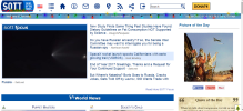
Just a note that long titles next to the title image slider on the front page will be "broken" when they appear as the last title, see attached screenshot.

A few general comments, fwiw: The "Welcome to Sott.net" and the date are kind of old-school :) This information doesn't serve any purpose IMO. But it's kind of nice...

Another thing: it's well known in usability circles that icons alone don't work (there needs to be text as well). I see this in myself: I still have to "hover" over the icons to find out what they're supposed to do. Especially the login icon is confusing IMO, because it looks more like a "logout" icon to me, so it's kind of counter-intuitive to click on it to log in. Maybe the icons could be reduced as well, for example the "home" icon is not really necessary because everyone knows the sott logo will get you there, and the RSS icon could be moved away as well I guess...

Just some minor things I noticed for a while. I really like the changes!
 

Attachments

  • Screenshot-2017-12-29 Sott net.png
    Screenshot-2017-12-29 Sott net.png
    81.9 KB · Views: 124
luc said:
Maybe the icons could be reduced as well, for example the "home" icon is not really necessary because everyone knows the sott logo will get you there

Only way I would want the home icon removed is if I could right-click the sott logo and open in a new tab. I use the home icon all the time to do that. In that way, the home icon certainly is usable and necessary.
 
luc said:
A few general comments, fwiw: The "Welcome to Sott.net" and the date are kind of old-school :) This information doesn't serve any purpose IMO. But it's kind of nice...

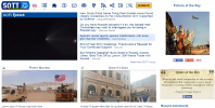
Fwiw: If the 'Welcome' and 'World News' lines were removed, we could see more news content without scrolling, e.g. when I browse the main page on my laptop, this is how much information I can see (see attached pic 1). If those two lines are removed, I could see three more sections (Quote of the Day, Puppet Masters and Society's Child) without scrolling (see attached pic 2). But on the other hand, it could be an excessive optimization.

Anyway, the new design is awesome, IMO. :thup:
 

Attachments

  • Sott 1.png
    Sott 1.png
    421 KB · Views: 108
  • Sott 2.png
    Sott 2.png
    820.9 KB · Views: 108
Is there place to still see 'Quantum Quirks' pictures with comment or is it no longer? I looked over the page a couple times and clicked around and didn't see it.
 
Bear said:
Is there place to still see 'Quantum Quirks' pictures with comment or is it no longer? I looked over the page a couple times and clicked around and didn't see it.

It's still at the bottom right of the page.
 
Siberia said:
luc said:
A few general comments, fwiw: The "Welcome to Sott.net" and the date are kind of old-school :) This information doesn't serve any purpose IMO. But it's kind of nice...

Fwiw: If the 'Welcome' and 'World News' lines were removed, we could see more news content without scrolling, e.g. when I browse the main page on my laptop, this is how much information I can see (see attached pic 1). If those two lines are removed, I could see three more sections (Quote of the Day, Puppet Masters and Society's Child) without scrolling (see attached pic 2). But on the other hand, it could be an excessive optimization.

Anyway, the new design is awesome, IMO. :thup:

I like the new layout of the page. Great work :thup:
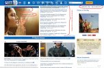
I was thinking in the similar lines as Siberia. See the attached screen. I made some modification there and I put some comments. It is just an idea . It doesn't mean that it is better than the current one. As I said I like the current layout of the page. These ideas can maybe help you somehow to improve even more the page layout or maybe these ideas will give you some other ideas how to make it even better.
Just networking. ;)
 

Attachments

  • 1.jpg
    1.jpg
    188.3 KB · Views: 76
Siberia said:
Fwiw: If the 'Welcome' and 'World News' lines were removed, we could see more news content without scrolling, e.g. when I browse the main page on my laptop, this is how much information I can see (see attached pic 1). If those two lines are removed, I could see three more sections (Quote of the Day, Puppet Masters and Society's Child) without scrolling (see attached pic 2). But on the other hand, it could be an excessive optimization.

What I meant was more that the "date" and "welcome to sott" text could be removed, whereas the slogan "the world for people who think" should absolutely remain on a prominent position IMO. As for excessive optimization, I guess it's about finding a balance between keeping the "traditional sott vibe" and keeping up with current viewing habits and de-facto standards (hiding/getting rid of all unnecessary information clearly is such a "standard" given that people nowadays are speed-browsing and expect to find the important stuff as fast as possible). But nothing wrong with erring on the conservative side IMO :)

Added:

Beau said:
luc said:
Maybe the icons could be reduced as well, for example the "home" icon is not really necessary because everyone knows the sott logo will get you there

Only way I would want the home icon removed is if I could right-click the sott logo and open in a new tab. I use the home icon all the time to do that. In that way, the home icon certainly is usable and necessary.

Ah, interesting that it doesn't work with the Sott logo, never noticed that. I wonder why? Or is it a firefox quirk?
 
Beau said:
Bear said:
Is there place to still see 'Quantum Quirks' pictures with comment or is it no longer? I looked over the page a couple times and clicked around and didn't see it.

It's still at the bottom right of the page.

In Firefox the whole right side column with the pictures and quote of the day doesn't show up. In Google Chrome and Internet Explorer it shows up and I see the pictures and such. Not sure why that is.
 
I think it is a good change and fits in with Sotts new more original content.
 
Bear said:
Beau said:
Bear said:
Is there place to still see 'Quantum Quirks' pictures with comment or is it no longer? I looked over the page a couple times and clicked around and didn't see it.

It's still at the bottom right of the page.

In Firefox the whole right side column with the pictures and quote of the day doesn't show up. In Google Chrome and Internet Explorer it shows up and I see the pictures and such. Not sure why that is.

I use Firefox and it's there for me.
 
Back
Top Bottom