Introduction:
For over 30 years, I have been giving talks on the science of climate change. When, however, I speak to a non-expert audience, and attempt to explain such matters as climate sensitivity, the relation of global mean temperature anomaly to extreme weather, that warming has decreased profoundly for the past 18 years, etc., it is obvious that the audience’s eyes are glazing over. Although I have presented evidence as to why the issue is not a catastrophe and may likely be beneficial, the response is puzzlement. I am typically asked how this is possible. After all, 97% of scientists agree, several of the hottest years on record have occurred during the past 18 years, all sorts of extremes have become more common, polar bears are disappearing, as is arctic ice, etc. In brief, there is overwhelming evidence of warming, etc. I tended to be surprised that anyone could get away with such sophistry or even downright dishonesty, but it is, unfortunately, the case that this was not evident to many of my listeners. I will try in this brief article to explain why such claims are, in fact, evidence of the dishonesty of the alarmist position.
The 97% meme:
This claim is actually a come-down from the 1988 claim on the cover of
Newsweek that all scientists agree. In either case, the claim is meant to satisfy the non-expert that he or she has no need to understand the science. Mere agreement with the 97% will indicate that one is a supporter of science and superior to anyone denying disaster. This actually satisfies a psychological need for many people. The claim is made by a number of individuals and there are a number of ways in which the claim is presented. A thorough
debunking has been given in the Wall Street Journal by Bast and Spencer. One of the dodges is to poll scientists as to whether they agree that CO2 levels in the atmosphere have increased, that the Earth has been warming (albeit only a little) and that man has played some part. This is, indeed, something almost all of us can agree on, but which has no obvious implication of danger. Nonetheless this is portrayed as support for catastrophism. Other dodges involve looking at a large number of abstracts where only a few actually deal with danger. If among these few, 97% support catastrophism, the 97% is presented as pertaining to the much larger totality of abstracts. One of my favorites is the
recent claim in the Christian Science Monitor (a once respected and influential newspaper): “For the record, of the nearly 70,000 peer-reviewed articles on global warming published in 2013 and 2014, four authors rejected the idea that humans are the main drivers of climate change.” I don’t think that it takes an expert to recognize that this claim is a bizarre fantasy for many obvious reasons. Even the United Nations Intergovernmental Panel on Climate Change (this body, generally referred to as the IPCC is the body created by the UN to provide ‘authoritative’ assessments of manmade climate change) doesn’t agree with the claim.
Despite the above, I am somewhat surprised that it was necessary to use the various shenanigans described above. Since this issue fully emerged in public almost 30 years ago (and was instantly incorporated into the catechism of political correctness), there has been a huge increase in government funding of the area, and the funding has been predicated on the premise of climate catastrophism. By now, most of the people working in this area have entered in response to this funding. Note that governments have essentially a monopoly over the funding in this area. I would expect that the recipients of this funding would feel obligated to support the seriousness of the problem. Certainly, opposition to this would be a suicidal career move for a young academic. Perhaps the studies simply needed to properly phrase their questions so as to achieve levels of agreement for alarm that would be large though perhaps not as large as was required for the 97% meme especially if the respondents are allowed anonymity.
The ‘warmest years on record’ meme:
| | |
| Figure 1a | Figure 1b | Figure 1c |
This simple claim covers a myriad of misconceptions. Under these circumstances, it is sometimes difficult to know where to begin. As in any demonization project, it begins with the ridiculous presumption that any warming whatsoever (and, for that matter, any increase in CO2) is bad, and proof of worse to come. We know that neither of these presumptions is true. People retire to the Sun Belt rather than to the arctic. CO2 is pumped into greenhouses to enhance plant growth. The emphasis on ‘warmest years on record’ appears to have been a response to the observation that the warming episode from about 1978 to 1998 appeared to have ceased and temperatures have remained almost constant since 1998. Of course, if 1998 was the hottest year on record, all the subsequent years will also be among the hottest years on record. None of this contradicts the fact that the warming (ie, the increase of temperature) has ceased. Yet, somehow, many people have been led to believe that both statements cannot be simultaneously true. At best, this assumes a very substantial level of public gullibility. The potential importance of the so-called pause (for all we know, this might not be a pause, and the temperature might even cool), is never mentioned and rarely understood. Its existence means that there is something that is at least comparable to anthropogenic forcing. However, the IPCC attribution of most of the recent (and only the recent) warming episode to man depends on the assumption in models that there is no such competitive process.
The focus on the temperature record, itself, is worth delving into a bit. What exactly is this temperature that is being looked at? It certainly can’t be the average surface temperature. Averaging temperatures from places as disparate as Death Valley and Mount Everest is hardly more meaningful than averaging phone numbers in a telephone book (for those of you who still remember phone books). What is done, instead, is to average what are called temperature anomalies. Here, one takes thirty year averages at each station and records the deviations from this average. These are referred to as anomalies and it is the anomalies that are averaged over the globe. The only attempt I know of to illustrate the steps in this process was by the late Stan Grotch at the Lawrence Livermore Laboratory. Figure 1a shows the scatter plot of the station anomalies. Figure 1b then shows the result of averaging these anomalies. Most scientists would conclude that there was a remarkable degree of cancellation and that the result was almost complete cancellation. However, instead, one stretches the temperature scale by almost a factor of 10 so as to make the minuscule changes in Figure 1b look more significant. The result is shown in Figure 1c. There is quite a lot of random noise in Figure 1c, and this noise is a pretty good indication of the uncertainty of the analysis (roughly +/- 0.2C). The usual presentations show something considerably smoother. Sometimes this is the result of smoothing the record with something called running means. It is also the case that Grotch used data from the UK Meteorological Office which was from land based stations. Including data from the ocean leads to smoother looking series but the absolute accuracy of the data is worse given that the ocean data mixes very different measurement techniques (buckets in old ship data, ship intakes after WW1, satellite measurements of skin temperature (which is quite different from surface temperature), and buoy data).
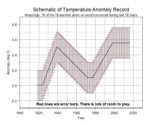
These issues are summarized in Figure 2 which presents an idealized schematic of the temperature record and its uncertainty. We see very clearly that because the rise ceases in 1998, that this implies that 18 of the 18 warmest years on record (for the schematic presentation) have occurred during the last 18 years. We also see that the uncertainty together with the smallness of the changes offers ample scope for adjustments that dramatically alter the appearance of the record (note that uncertainty is rarely indicated on such graphs).
At this point, one is likely to run into arguments over the minutia of the temperature record, but this would simply amount to muddying the waters so to speak. Nothing can alter the fact that the changes one is speaking about are small. Of course ‘small’ is relative. Consider three measures of smallness.
Figure 3 shows the variations in temperature in Boston over a one month period. The dark blue bars show the actual range of temperatures for each day. The dark gray bars show the climatological range of temperatures for that date, and the light gray bars show the range between the record-breaking low and record-breaking high for that date. In the middle is a red line. The width of that line corresponds to the range of temperature in the global mean temperature anomaly record for the past 175 years. This shows that the temperature change that we are discussing is small compared to our routine sensual experience. Keep this in mind when someone claims to ‘feel’ global warming.
The next measure is how does the observed change compare with what we might expect from greenhouse warming. Now, CO2 is not the only anthropogenic greenhouse gas.
|
Figure 4. Red bar represents observations. Gray bars show model predictions.
|
When all of them are included, the UN IPCC finds that we are just about at the greenhouse forcing of climate that one expects from a doubling of CO2, and the temperature increase has been about 0.8C. If man’s emissions are responsible for all of the temperature change over that past 60 years, this still points to a lower sensitivity (sensitivity, by convention, generally refers to the temperature increase produced by a doubling of CO2 when the system reaches equilibrium) than produced by the least sensitive models (which claim to have sensitivities of from 1.5-4.5C for a doubling of CO2). And, the lower sensitivities are understood to be unproblematic. However, the IPCC only claims man is responsible for most of the warming. The sensitivity might then be much lower. Of course, the situation is not quite so simple, but calculations do show that for higher sensitivities one has to cancel some (and often quite a lot) of the greenhouse forcing with what was assumed to be unknown aerosol cooling in order for the models to remain consistent with past observations (
a recent article in the Bulletin of the American Meteorological Society points out that there are, in fact, quite a number of arbitrary adjustments made to models in order to get some agreement with the past record). As the aerosol forcing becomes less uncertain, we see that high sensitivities have become untenable. This is entirely consistent with the fact that virtually all models used to predict ‘dangerous’ warming over-predict observed warming after the ‘calibration’ periods. That is to say, observed warming is small compared to what the models upon which concerns are based are predicting. This is illustrated in Figure 4. As I have mentioned, uncertainties allow for substantial adjustments in the temperature record. One rather infamous case involved NOAA’s adjustments in a paper by Karl et al that replace the pause with continued warming. But it was easy to show that even with this adjustment,
models continued to show more warming than even the ‘adjusted’ time series showed. Moreover, most papers since have rejected the Karl et al adjustment (which just coincidentally came out with much publicity just before the Paris climate conference).
The third approach is somewhat different. Instead of arguing that the change is not small, it argues that the change is ‘unprecedented.’ This is Michael Mann’s infamous ‘hockey stick.’ Here, Mann used tree rings from bristle cone pines to estimate Northern Hemisphere temperatures back hundreds of years. This was done by calibrating the tree ring data with surface observations for a thirty year period, and using this calibration to estimate temperatures in the distant past in order to eliminate the medieval warm period. Indeed, this reconstruction showed flat temperatures for the past thousand years. The usual test for such a procedure would be to see how the calibration worked for observations after the calibration period. Unfortunately, the results failed to show the warming found in the surface data. The solution was starkly simple and stupid. The tree ring record was cut off at the end of the calibration period and replaced by the actual surface record. In the Climategate emails (Climategate refers to a huge release of emails from various scientists supporting alarm where the suppression of opposing views, the intimidation of editors, the manipulation of data, etc. were all discussed), this was referred to as Mann’s trick.
The whole point of the above was to make clear that we are not concerned with warming per se, but with how much warming. It is essential to avoid the environmental tendency to regard anything that may be bad in large quantities to be avoided at any level however small. In point of fact small warming is likely to be beneficial on many counts. If you have assimilated the above, you should be able to analyze media presentations like
this one to see that amidst all the rhetoric, the author is pretty much saying nothing while even misrepresenting what the IPCC says.
The extreme weather meme:
Every line weather forecaster knows that extreme events occur someplace virtually every day. The present temptation to attribute these normally occurring events to climate change is patently dishonest. Roger Pielke, Jr. actually wrote a
book detailing the fact that there is no trend in virtually any extreme event (including tornados, hurricanes, droughts, floods, etc.) with some actually decreasing. Even the UN’s IPCC acknowledges that there is no basis for attributing such events to anthropogenic climate change.
|
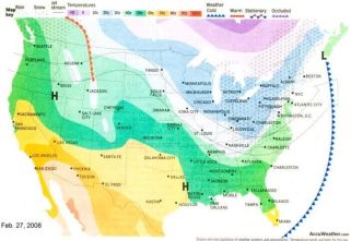
Figure 5. Temperature map for North America.
|
The situation with respect to extreme temperatures actually contradicts not just observations but basic meteorological theory. Figure 5 shows a map of temperatures for North America on February 27, 2008. Extreme temperatures at any location occur when air motions carry air from the coldest or warmest points on the map. Now, in a warmer climate, it is expected that the temperature difference between the tropics and the high latitudes will decrease. Thus the range of possible extremes will be reduced. More important is the fact that the motions that carry these temperatures arise from a process called baroclinic instability, and this instability derives from the magnitude of the aforementioned temperature difference. Thus, in a warmer world, these winds will be weaker and less capable of carrying extreme temperatures to remote locations. Claims of greater extremes in temperature simply ignore the basic physics, and rely, for their acceptance, on the ignorance of the audience.
The claims of extreme weather transcend the usual use of misleading claims. They often amount to claims for the exact opposite of what is actually occurring. The object of the claims is simply to be as scary as possible, and if that requires claiming the opposite of the true situation, so be it.
Sea level rise:
Globally averaged sea level appears to have been rising at the rate of about 6 inches a century for thousands of years. Until the advent of satellites, sea level was essentially measured with tide gauges which measure the sea level relative to the land level. Unfortunately, the land level is also changing, and as
Emery and Aubrey note, tectonics are the major source of change at many locations. Beginning in 1979 we began to use satellites to measure actual sea level. The results were surprisingly close to the previous tide gauge estimates, but slightly higher, but one sees from Wunsch et al (DOI: 10.1175/2007JCLI1840.1) that one is in no position to argue that small differences from changing methodologies represents acceleration. Regardless, the changes are small compared to the claims that suggest disastrous changes. However, even in the early 1980’s advocates of warming alarm like S. Schneider argued that sea level would be an easily appreciated scare tactic. The fact that people like Al Gore and Susan Solomon (former head of the IPCC’s Scientific Assessment) have invested heavily in ocean front property supports the notion that the issue is propagandistic rather than scientific.
Arctic sea ice:
Satellites have been observing arctic (and Antarctic) sea ice since 1979. Every year there is a pronounced annual cycle where the almost complete winter coverage is much reduced each summer. During this period there has been a noticeable downtrend is summer ice in the arctic (with the opposite behavior in the Antarctic), though in recent years, the coverage appears to have stabilized. In terms of climate change, 40 years is, of course, a rather short interval. Still, there have been the inevitable attempts to extrapolate short period trends leading to claims that the arctic should have already reached ice free conditions. Extrapolating short term trends is obviously inappropriate. Extrapolating surface temperature changes from dawn to dusk would lead to a boiling climate in days. This would be silly. The extrapolation of arctic summer ice coverage looks like it might be comparably silly. Moreover, although the satellite coverage is immensely better than what was previously available, the data is far from perfect. The satellites can confuse ice topped with melt water with ice free regions. In addition, temperature might not be the main cause of reduced sea ice coverage. Summer ice tends to be fragile, and changing winds play an important role in blowing ice out of the arctic sea. Associating changing summer sea ice coverage with climate change is, itself, dubious. Existing climate models hardly unambiguously predict the observed behavior. Predictions for 2100 range from no change to complete disappearance. Thus, it cannot be said that the sea ice behavior confirms any plausible prediction.
It is sometimes noted that concerns for disappearing arctic sea ice
were issued in 1922, suggesting that such behavior is not unique to the present. The data used, at that time, came from the neighborhood of Spitzbergen. A marine biologist and climate campaigner has argued that what was
described was a local phenomenon, but, despite the claim, the evidence presented by the author is far from conclusive. Among other things, the author was selective in his choice of ‘evidence.’
All one can say, at this point, is that the behavior of arctic sea ice represents one of the numerous interesting phenomena that the earth presents us with, and for which neither the understanding nor the needed records exist. It probably pays to note that melting sea ice does not contribute to sea level rise. Moreover, man has long dreamt of the opening of this Northwest Passage. It is curious that it is now viewed with alarm. Of course, as Mencken noted, “The whole aim of practical politics is to keep the populace alarmed (and hence clamorous to be led to safety) by an endless series of hobgoblins, most of them imaginary.” The environmental movement has elevated this aim well beyond what Mencken noted.
Polar bear meme:
I suspect that Al Gore undertook considerable focus-group research to determine the remarkable effectiveness of the notion that climate change would endanger polar bears. His use of an obviously photo shopped picture of a pathetic polar bear on an ice float suggests this. As Susan Crockford, a specialist in polar bear evolution, points out, there had indeed been a significant decrease in polar bear population in the past due to hunting and earlier due to commercial exploitation of polar bear fur. This has led to successful protective measures and sufficient recovery of
polar bear population, that hunting has again been permitted. There is no evidence that changes in summer sea ice have had any adverse impact on polar bear population, and, given that polar bears can swim for over a hundred miles, there seems to be little reason to suppose that it would. Nonetheless, for the small community of polar bear experts, the climate related concerns have presented an obvious attraction.
Ocean acidification:
This is again one of those obscure claims that sounds scary but doesn’t stand up to scrutiny. Ever since the acid rain scare, it has been realized that the public responds with alarm to anything with the word ‘acid’ in it. In point of fact, the ocean is basic rather than acidic (ie, its ph is always appreciably higher than 7, and there is no possibility of increasing levels of atmospheric CO2 bringing it down to 7; note that ph is a measure of acidity or basicness: values greater than 7 are basic and less than 7 acid.), and the purported changes simply refer to making the ocean a bit less basic. However, such a more correct description would lack the scare component. As usual, there is so much wrong with this claim that it takes a fairly long article to go over it all. I recommend the following
source.
Death of coral reefs:
The alleged death of coral reefs is partly linked to the acidification issue above, and as we see, the linkage is almost opposite to what is claimed. There is also the matter of warming per se leading to coral bleaching. A typical alarmist presentation can be found
here.
The article is behind a pay wall, but most universities provide access to
Nature. The reasoned response to this paper is provided
here.
As Steele, the author of the above, points out, bleaching has common causes other than warming and is far from a death sentence for corals whose capacity to recover is substantial. This
article is a bit polemical, but essentially correct.
Global warming as the cause of everything:
As we see from the above, there is a tendency to blame everything unpleasant on global warming. The absurd extent of this tendency is illustrated on the following
here. That hasn’t stopped the EPA from using such stuff to claim large health benefits for its climate change policies. Moreover, I fear that with so many claims, there is always the question ‘what about ….?’ Hardly anyone has the time and energy to deal with the huge number of claims. Fortunately, most are self-evidently absurd.
Nation magazine recently came up with what is
a bit of a champion is this regard. CO2, it should be noted, is hardly poisonous. On the contrary, it is essential for life on our planet and levels as high as 5000 ppm are considered safe on our submarines and on the space station (current atmospheric levels are around 400 ppm, while, due to our breathing, indoor levels can be much higher). The
Nation article is typical in that it makes many bizarre claims in a brief space. It argues that a runaway greenhouse effect on Venus led to temperatures hot enough to melt lead. Of course, no one can claim that the earth is subject to such a runaway, but even on Venus, the hot surface depends primarily on the closeness of Venus to the sun and the existence of a dense sulfuric acid cloud covering the planet. Relatedly, Mars, which also has much more CO2 than the earth, is much further from the sun and very cold. As we have seen many times already, such matters are mere details when one is in the business of scaring the public.
Concluding remarks:
The accumulation of false and/or misleading claims is often referred to as the ‘overwhelming evidence’ for forthcoming catastrophe. Without these claims, one might legitimately ask whether there is any evidence at all.
Despite this, climate change has been the alleged motivation for numerous policies, which, for the most part, seem to have
done more harm than the purported climate change, and have the obvious capacity to do much more. Perhaps the best that can be said for these efforts is that they are acknowledged to have little impact on either CO2 levels or temperatures despite their immense cost. This is relatively good news since there is ample evidence that both changes are likely to be beneficial although the immense waste of money is not.
I haven’t spent much time on the details of the science, but there is one thing that should spark skepticism in any intelligent reader. The system we are looking at consists in two turbulent fluids interacting with each other. They are on a rotating planet that is differentially heated by the sun. A vital constituent of the atmospheric component is water in the liquid, solid and vapor phases, and the changes in phase have vast energetic ramifications. The energy budget of this system involves the absorption and reemission of about 200 watts per square meter. Doubling CO2involves a 2% perturbation to this budget. So do minor changes in clouds and other features, and such changes are common. In this complex multifactor system, what is the likelihood of the climate (which, itself, consists in many variables and not just globally averaged temperature anomaly) is controlled by this 2% perturbation in a single variable? Believing this is pretty close to believing in magic. Instead, you are told that it is believing in ‘science.’ Such a claim should be a tip-off that something is amiss. After all, science is a mode of inquiry rather than a belief structure.
Richard Lindzen is the Alfred P. Sloan Professor of Atmospheric Sciences, Emeritus at Massachusetts Institute of Technology.