Why modern architecture is making us sick

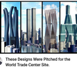
From bad (occult numerological "11" design) to worse. Thankfully, "they" chose an elegant design composed of pyramidal sides, alternately inverted, and mockingly named the "Freedom Tower," which of course is 1776 feet tall, memorializing our Declaration of "Independence".


Attachments

  • 1725144795237.png
    1725144795237.png
    161.1 KB · Views: 3
Last edited:
Jaguar is next in line to change its logo to a simpler form.

British luxury car manufacturer Jaguar has revamped its branding with a new logo and a commitment to becoming an all-electric carmaker by 2026. The minimalist logo, featuring a stylized 'Jaguar' wordmark, has sparked mixed reactions online, with some praising its modern look while others criticize its simplicity.

Jaguar, the British luxury automaker brand, unveiled its new logo and branding strategy on November 19. The company, that has been around since 1935 manufacturing various kinds of vehicles, is moving towards becoming an only-electric car maker. In recent times, the manufacturer has been going through a process of metamorphosis to evolve into an electric vehicle-making brand by 2026. As part of the process, the brand has taken a major step by adopting a new brand identity. Accompanying this, the brand has unveiled new logos which will be featured on upcoming models.

The founder of Jaguar, Sir William Lyons, was of the opinion that ‘a Jaguar should be a copy of nothing’, which serves as the central idea behind the brand's latest philosophy called ‘Exuberant Modernism’. The new graphics mark a notable shift from the earlier theme, conveying the brand's transformation in both its design and market positioning.

Jaguar released a video showcasing the new branding. Stylised as ‘Jaguar’, the company’s new logo comes ahead of Jaguar's plans to launch three new electric cars in 2026 and was aimed at being a ‘fire break’ as the company moves towards becoming a fully electric luxury brand.

The new Jaguar logo

Jaguar MD Rawdon Glover said taking new cars off sale was ‘intentional’ as it looked to create a barrier between the old models and the new-look Jaguars. As per his statement, “From a marketing sense, at the moment, there are lots of people out there that know what Jaguar stands for, and actually it doesn’t stand for them, and we’ve seen that in terms of how they’ve responded to the offering that’s been in the market for the last 10 or 20 years. We need to change people’s perceptions of what Jaguar stands for. And that’s not a straightforward, easy thing to do. So having a fire break in between old and new is, actually, very helpful.

Diving into details, Jaguar's new brand identity consists of four elements. Starting with the new logo, the brand calls it the ‘Device Mark’. This uses a unique font that follows the basics of symmetry and simplicity while maintaining a geometric form. It consists of lowercase and uppercase letters.

Second comes, ‘strikethrough’. The brand is calling it a graphic code with a series of horizontal lines embedded within a rectangular border. This is also a part of the new "leaper" logo which in other words is an evolution of the jaguar mascot which has been seen on the cars of the brand for years. It is different from the previous logo as it now features a more angular version of the pouncing cat.

The logo featuring a jaguar's face, which has been seen on the grilles of Jaguar vehicles seems to have been replaced with a new circular emblem. This badge is inspired by a new typeface that includes a ‘J’ and an ‘r’ within a circle, with the two letters presented in brass and connected to the rounded border. This will be complemented by a vibrant new colour scheme, which Jaguar claims will utilize the primary colours of red, blue, and yellow.


The 102-year-old luxury automaker is replacing its former logo, resplendent in all capital letters, with a new one that is supposed to be a “powerful celebration of modernism,” the company announced Tuesday.

The gold-colored Jaguar letters, designed with a custom font, are spaced out and in lowercase, except for “G” and “U,” which the company says demonstrates the “unexpected by seamlessly blending upper and lowercase characters in visual harmony.”

Other changes to Jaguar’s branding include a redesigned pouncing cat logo, called the “Leaper,” and a new monogram that incorporates the “J” and “R” in the brand name. Car and Driver reports that the Leaper, which has adorned its cars for several decades, is being eliminated in favor of the badge.

“This is a reimagining that recaptures the essence of Jaguar, returning it to the values that once made it so loved, but making it relevant for a contemporary audience,” said Gerry McGovern, Jaguar Land Rover’s chief creative officer, in a press release.

He even joked a press event that Jaguar has “not been sniffing the white stuff — this is real,” according to Car Dealer Magazine.


By the time we’d transitioned through Jaguar’s House of Mirrors and got to the reveal of the new concept car, some press were questioning whether they’d inadvertently been trapped in a cult’s conference. It was all incredibly bizarre.


And their new add that follows this metamorphosis has no cars in it:

 
In the case of this decently designed building, nobody saw the pseudo artist coming and sticking a big sunny smile on the facades. Its tentacules are as far reaching as the modern fall of sense of beauty and harmony.

"Built by the MAQLA studio and with a large sculpture made of grinded Murano glass by Jaume Ripollés on the facade, the building was intended as a tribute to the Mediterranean, its light, its good climate. Described as a "modernist work", it was inaugurated in 2008 by Mayor Alberto Fabra in Castellon/Spain, who said that "Ripollés is like José Tomás, who is close to culture, who generates feelings among the people with his art and his work, who leaves no one indifferent and who leaves his work for the history of Castellón". He holds a record unknown to many: the great sun is considered the largest Spanish sculpture attached to a block of apartments. Knowledge takes up no room, but in this case, the ugliness occupies exactly 38 meters wide and a height of over 15 meters. The people of Castellón have never been very happy with this building, but it is also true that many say that "all of Castellón is ugly", so it does not look out of place either."

edificio-sol-en-castellon_fdc182b5_230627190409_2000x1500.jpg
 
A colleague told me she knows an owner who has stopped putting energy into his restaurant's interior design because "people just look down at their phones, they don't care about their surroundings." I was shocked to hear that. Then I thought: "If there is nobody to look at an object (e.g. a building), does it matter if it's ugly?" I think it does matter, because things are not just processed visually—there is an energetic flow through the structure (Chi energy as described in Feng Shui, for example).
Chi in Feng Shui
Chi refers to vital life force or energy. It is an important aspect of designing a room with feng shui. A large room with little furniture can cause an overwhelm of chi, making you feel lost. On the other hand, a small room that’s packed with clutter doesn’t give chi space to move, resulting in feelings of stagnation.
I guess continuously looking at a screen, especially a small screen, is like being energetically constrained or imprisoned. It alters the perception of the outside world, which doesn't need to look very appealing anymore. No wonder why dullness, repetitiveness, and lack of details are "tolerated" by the masses.
 
In the case of this decently designed building, nobody saw the pseudo artist coming and sticking a big sunny smile on the facades. Its tentacules are as far reaching as the modern fall of sense of beauty and harmony.

"Built by the MAQLA studio and with a large sculpture made of grinded Murano glass by Jaume Ripollés on the facade, the building was intended as a tribute to the Mediterranean, its light, its good climate. Described as a "modernist work", it was inaugurated in 2008 by Mayor Alberto Fabra in Castellon/Spain, who said that "Ripollés is like José Tomás, who is close to culture, who generates feelings among the people with his art and his work, who leaves no one indifferent and who leaves his work for the history of Castellón". He holds a record unknown to many: the great sun is considered the largest Spanish sculpture attached to a block of apartments. Knowledge takes up no room, but in this case, the ugliness occupies exactly 38 meters wide and a height of over 15 meters. The people of Castellón have never been very happy with this building, but it is also true that many say that "all of Castellón is ugly", so it does not look out of place either."

edificio-sol-en-castellon_fdc182b5_230627190409_2000x1500.jpg
it is ugly
 
I will tell you how skyscrapers are built in Russia now. The main problem of bad architecture is money, getting the maximum profit from selling the building. Therefore, constant optimization of the project, cheapening of materials, layouts with minimum areas according to standards. Cheapening of contracting construction companies. Documentation developers are also the cheapest, or those who will give away part of the profit from the contract - direct corruption. Everyone participates in corruption - from the mayor to the chief architect of the city. The project itself is ordered from corrupt famous architects who share the profit from the contracts. We call it kickbacks.
The second problem is tyrant managers. Mini-oligarchs manage, waste money on nonsense and interfere in processes from the design to construction.
The third problem is deadlines. They are always in deadline mode. Haste leads to additional mistakes. Everyone is afraid of being fired for mistakes. Everyone is afraid of everything. Above the departments are the supervisory managers, whose only function is to be Cerberus over those below them.
As a result, there is frequent burnout, staff turnover, etc. Everything is done on the run, at full speed. Nobody needs this damn project anymore.
In short, this is the reality in an ordinary large construction company.
 
Back
Top Bottom