Why modern architecture is making us sick

I think the uglifying and removing of windows so as not to ‘distract’ people in the name of ‘productivity’ is very shortsighted. I would posit that the opposite is true - natural and beautiful environment is likely to increase productivity. It’s possibly a similar mechanism as productivity increases if you have regular breaks as opposed to work continuously. I know for a fact that many people stay at their desk and ‘simulate’ working to not disturb the ‘corporate ambiance’, but are they productive?

I remember in my student days I worked in a company that was involved in mailings. My job was to type addresses into a program that they had obtaines from God know where. In short, extremely dull and boring. But the ’corporate culture’ at this place was such that there was a drink ‘vending machine’ (but free), where you could get a can of soda and have a chat with some other office worker. And it was encouraged by my boss to take regular breaks and have a can. And I remember that I would take a 15 min break every 2 hours or so, which would revitalize me and probably made more than up for the lost work in these breaks.

So for me the question is - I am sure that fundamentally the hierarchy (whoever that is) is aware of this fact. So that means that it is not really about productivity, but something deeper - I don’t know what exactly, maybe control?

Fully agree. Indeed I think there is a good possibility that control plays at least a contributing if not major role of why certain companies decide to handle the work and interpersonal environment in that way.
 
I think the uglifying and removing of windows so as not to ‘distract’ people in the name of ‘productivity’ is very shortsighted. I would posit that the opposite is true - natural and beautiful environment is likely to increase productivity. It’s possibly a similar mechanism as productivity increases if you have regular breaks as opposed to work continuously. I know for a fact that many people stay at their desk and ‘simulate’ working to not disturb the ‘corporate ambiance’, but are they productive?

I remember in my student days I worked in a company that was involved in mailings. My job was to type addresses into a program that they had obtaines from God know where. In short, extremely dull and boring. But the ’corporate culture’ at this place was such that there was a drink ‘vending machine’ (but free), where you could get a can of soda and have a chat with some other office worker. And it was encouraged by my boss to take regular breaks and have a can. And I remember that I would take a 15 min break every 2 hours or so, which would revitalize me and probably made more than up for the lost work in these breaks.

So for me the question is - I am sure that fundamentally the hierarchy (whoever that is) is aware of this fact. So that means that it is not really about productivity, but something deeper - I don’t know what exactly, maybe control?
yes, they want to control you. in the times of the concorde, they wanted to delete the windows. the same for the mercury capsule, but the astronauts (glenn ?) vehemently opposed this... man is a visual animal...
 
I see the same thing happening in my city. Modern buildings are certainly more beautiful than commie buildings, but what modern buildings do not have is a planned environment where other necessities surround those buildings. No private entrepreneur would build parks, kindergartens and other stuff, except for the stuff that can be built inside the building itself, like the premises for shops on the ground floor.

 
I see the same thing happening in my city. Modern buildings are certainly more beautiful than commie buildings, but what modern buildings do not have is a planned environment where other necessities surround those buildings. No private entrepreneur would build parks, kindergartens and other stuff, except for the stuff that can be built inside the building itself, like the premises for shops on the ground floor.

I suppose it is all relative. Compared to the pre war housing, with no running water, and very primitive living conditions, it seems like an improvement. But looking at the planned housing that popped up later, they have the look and feel of 15 minute cities. Designed to keep you in a small area, with little mobility options. And it is interesting that now these types of planned, 15 minute cities are being promoted again, all around the AGW, and sustainability doctrines. I am sure back then, you could not expect much more from any communist state, but the way they planned their societies was always striving to keep freedom in check. Just the nature of the beast I guess.

Anyway, just my observation...
 
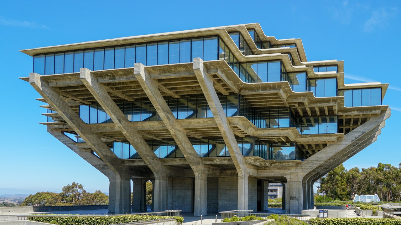
To my mind this is called Brutalist architecture, a form of building and styles commonly associated with the Soviet Union.

No colour, dark black and black looking edifices,

This article Architectural magazine.

What Is Brutalist Architecture?


Brutalist architecture is a style of building design developed in the 1950s in the United Kingdom following World War II. With an emphasis on construction and raw materials, the aesthetic evolved as reconstruction efforts were underway in the post-war era. “If modernism is about architecture being honest, Brutalist design is about architecture being brutally honest,” Geddes Ulinskas, principal of Geddes Ulinskas Architects, adds. “Forms are as simple as can be and materials are stripped to be as bare and raw as possible.”

Seems to me just another form of nihilistic ideology, written not in stone but the modern synthetic material of the day..Synthetic stone.

I have noticed, many new apartment new build structures where I live in Canada (BC) appear to follow this model.

And now with the post COVID era, and loss of resources..within the UK and EU, including North America, and it's cohorts in far flung countries of the Pacific the totalitarian ideology, it it any wonder we have lost the ability to create beautiful buildings and structures, that humanity wants to enter into.

Ah! My mind is drawn back to the ancient structures of humanities past, wrought in stone, lasting forever, so it seems, to send us a message, but no ears want to hear.
 
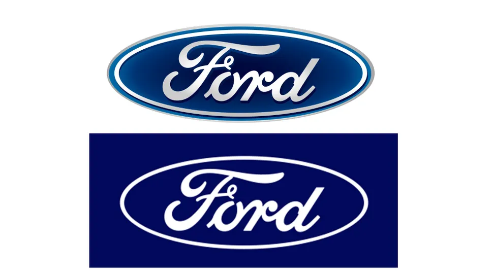
Ford also changed their logo. The next step is of course the black and white logo with simplified font.

nhnQ7otwXeCUJu7WPmsyfG-970-80.jpg.webp


There's been a clear trend in car logos over the past few years. One by one, most of the big car makers have dropped the gradients and 3D touches added in previous decades for simpler, flatter designs. That script-based Ford logo was one of the last to resist, but it seems that it's finally given in.

The new Ford badge retains the classic stylised Ford script that's been used in various forms since it was developed by the company’s first chief engineer, Childe Harold Wills, in 1909. The oval, first introduced in 1912, is also present and familiar. But the design has been simplified, making it more similar to how it looked when it was reworked by the great designer Massimo Vignelli in the 1960s.

The Chrome finish and out border have been replaced with simple white, and the inner border has been removed, allowing the text to be enlarged slightly to fill the space. The design doesn't constitute much of a surprise. In fact, it's perhaps more surprising that it took Ford so long to join the trend, which has seen a mixed response (see our round up of the good, the bad and the ugly of car logo redesigns). But with a logo as recognisable as Ford's, it was wise not to introduce a more radical change.

 
Andrei Martyanov made some interesting comparisons between Russian and US culture, where he also said this about the purpose of high art:

I want to reiterate--high art, high culture--from beautiful architecture, to literature, to music--while ARE NOT in and of themselves panacea against brutality, criminality or corruption--they are absolutely essential in bringing young generations into the world of proper aesthetics, beauty and taste. This, obviously, doesn't preclude people from becoming criminals or psychopaths, but it REDUCES the number of such incidents, when the culture is built around such aesthetics.

You can read and hear his views here:

 
Two weeks ago, we went to a jump place relatively close by to celebrate our son`s birth date. It was his choice, and a lot of his friends like that place too, so we thought why not. I was in few similar establishments before, but none of them was as dark and impersonal as this one.

The "every kid`s dream" is a dungeon with no light at all. The only light you ever going to see is right at the entrance where the reception is. Stuffy air. Unfinished walls and ceiling painted with gunship grey. Noise which I refuse to call music that is nothing but beat and of course a lot of junk food. Who would want to eat there anyway? Btw the dude in the picture is not our son, but the level of darkness is depicted correctly.

QL-2.jpg


Now compare to this one. Below is a picture of the gymnasium I used to go to for my gymnastic classes back in eighties. Notice how light, airy and spacious the old building is. It was a joy to be there. Btw half of the blue floor mat is covering a decent size "swimming pool" full of foamy cushions, which used to be a highlight of the day at end of the class when all kids could jump in :-)

9a14fe13e96454a3b731d23ca28c138f.jpg


The last drop that made the surreal experience complete for me was the moment when our now 9 year old announced after 3 hours of jumping and running with his friends that this was his best birthday ever. All I could think of was ??what?? Did he really not pay attention to the overall ugliness or it simply was not important to him at all?
 
There was a book about architecture, I was reading some time ago, written in the late 1800s, which summed up perfectly, for me, the gist of this thread. Uggly houses are designed by uneducated architects.
I would not like to join the choir doing the litany, but to add my deep insatisfaction, I’ll just say that lots of money does not bring taste nor class.
 
And it continues...

Google Maps has changed its colors and people are upset

Most Google Maps users seem opposed to the changes and want the old colors back.

Google Maps has a new color scheme that’s now rolling out widely.
Roads are now gray, water bodies are a lighter blue, forested areas are a darker shade of green, and the route color is a jarring blue.
Most Google Maps users seem opposed to the changes and want the old colors back.

Google Maps is now widely rolling out its new color palette, and users are understandably annoyed. While the changes aren’t too drastic, the new Google Maps colors have taken users by surprise and left them feeling unsettled.

Reddit and Twitter are filled with arguments against Google’s new color choices. Roads that were once depicted with a white color are now gray. The blue color of water bodies is now significantly paler, while forested areas are a darker shade of green than before. The route indicator is also a much brighter and jarring blue. To those who have been using Google Maps for years, these changes are disturbing.

“Not a fan. Just didn’t like them when I started seeing them a week or so ago. Not as easy to read for me. I’d switch back to the old colors if I could,” said one Reddit user.

“Classic Google changes what was totally fine and makes it worse for no apparent reason,” said another.

Users feel roads are hard to see now in Google Maps when you’re not fairly zoomed in. The biggest complaint that people have is that the new colors make it difficult to view details on the map because they’re extremely washed out.

It’s unclear why Google suddenly decided to switch colors in Google Maps, but perhaps angry users can convince the company to revert to the older colors.


Oh, that last google maps one is another bad idea... As a person who is not very good at reading maps, this will make it even harder. :-[ :lol:

Funny, I just opened Youtube, and this came on top.


It's so ridiculous, I wouldn't be surprised, LOL.

An argument for all those changes is that they logos need to fit as tiny images on smart phones, but I think it's just also representative of a dumbed down society, the one who is addicted to those smart phones... It goes with the "minimalist" nonsense. Everything needs to be two-dimensional, gray, flat, empty. It's the flat Earth of the design and architectural world.
 

Trending content

Back
Top Bottom