The Ice Age Cometh! Forget Global Warming!

Two new icebergs have broken off the Grey Glacier in Chile's Patagonia in recent weeks, amid fears that such ruptures are becoming more frequent, scientists told Reuters.

Fresh iceberg ruptures in Chile's Patagonia raise alarm
Two new icebergs are seen after breaking off from the Grey glacier in Patagonia, Chile March 9, 2019. Picture taken March 9, 2019.  Ricardo Jana/Courtesy of Chilean Antarctic Institute (INACH)/Handout via REUTERS


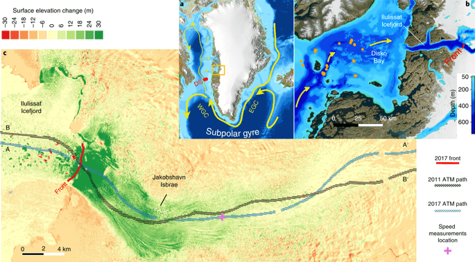
The breaks, which occurred on Feb. 20 and March 7, came after a larger block of ice the size of three soccer fields, (380 meters (1,247 feet) by 350 meters, separated from the glacier, which sits in a glacial lake in Torres del Paine National Park in southern Chile, in November 2017.


The most significant rupture to the glacier before that was recorded in the early 1990s. Scientists link the increased frequency of breaks to rising temperatures.

“There is a greater frequency in the occurrence of break-off in this east side of the glacier and more data is required to assess its stability,” said Ricardo Jana, researcher and member of the climate change area of the Chilean Antarctic Institute (INACH).

In recent days, “temperature rises above the normal average and intense rainfall were registered together with an increase in water level in the lake, factors that could explain the separation,” he added.

Researchers from universities in Germany and Brazil, together with experts from INACH and other local entities, have been studying the Grey Glacier since 2015 under an international cooperation program.

In December of this year, Chile will host the United Nations climate change summit, COP 25.
 
On SVS: Arctic Sea Ice Maximum 2019 they write:
After growing through the fall and winter, sea ice in the Arctic appears to have reached its annual maximum extent. The 2019 wintertime extent ties with 2007’s as the 7th smallest extent of winter sea ice in the satellite record, according to scientists at the NASA-supported National Snow and Ice Data Center (NSIDC) and NASA.

On March 13, the extent of the Arctic sea ice cover peaked at 5.71 million square miles (14.78 million square kilometers). This winter’s maximum extent is 332,000 square miles (860,000 square kilometers) below the 1981 to 2010 average maximum – equivalent to missing an area of ice larger than the state of Texas.
See also the video:
and the map and graph from Polar Portal
29504
In Greenland the accumulation of ice during the winter has been low according to Polar Portal. Red indicates lost surface mass, blue is gain.
29505
The blue line has been in the lows all winter and the distance to the average has been growing. Even with moderate melt in summer it will most likely end up with a net loss.

Still the ice at the North Pole has not melted:
29506

And the thickness of the ice:
29507
 
In Mammoth, the snow is so deep residents must tunnel out. There’s a history to that

By February, the snow made many neighborhoods here feel subterranean.
Twenty-foot walls of white, corniced by the wind, leaned over the plowed roads. Residents worked feverishly to keep the snow from swallowing their homes. They dug tunnels and narrow passageways to the street, opened portals to get light through second-story windows, shoveled dangerous weight off their roofs.

Unoccupied homes were so buried that a child might unknowingly sled down one. On still nights, when the wind stopped and the plows had passed, the silence was absolute. Only the streetlights and spirals of smoke from unseen chimneys suggested human life.
This year’s record-setting February and continued storms have reconnected residents to a historic rite of passage in California’s highest town, a place that largely came to be because of its monumental snowfall.

Brenda McCann had gone through the many harsh Mammoth snowfalls since her first autumn here in 1998, when four feet fell in two days at Thanksgiving. The old-timers called her neighborhood of Old Mammoth “Moleville” because of its propensity to get buried, turning homes into burrows.
The long drought began to make those eerie winters feel distant, a fading quirk of a town just five hours from Los Angeles that regularly made winters in Buffalo look moderate.
But the heavy snows of 2017 brought back memories. Many homeowners were unprepared, and roofs collapsed.
This winter, the town was ready, as 17 feet of snow landed in February, with more storms following in March.
“My whole house is encased in snow,” said McCann, 54, last week. “I’m in an igloo.”

29510


29509

While her house sits a good four feet above her driveway, she had to climb five feet over a frozen berm to get out, until she had someone plow it away. In the backyard, the snow rises straight up over the two-story roof of her next-door neighbor.
“I’ve seen a lot of dogs on roofs this winter.”
During and after white-out days, people spend so much time shoveling, blowing, shoveling, that their backs wince and their abs feel like they’d done a couple hundred sit-ups. Members come into the gym where McCann works, they say, “I worked out all day, I just need the Jacuzzi.”
One of her friends, who had moved back to Mammoth in summer after many years away, told her: “I’m outta here. Now I remember why I moved away in the first place.”
The sheer volume of the snow creates a logistical puzzle. Where to put it?
The town’s public works crews and the California Department of Transportation use large ribbon-bladed blowers to shoot it up on hills between homes, where it builds until it looms over the roads like a wave ready to take a ship down. Dump trucks haul the rest to a site down Highway 203, where it’s bulldozed off the side of the mesa.
From the huge ski operations on the mountain to town hall to condo complexes to small cabins and trailer homes, the urgent matter day and night has been “snow management.”
“People can’t understand this type of snow,” said Grady Dutton, the town’s public works director. “Fifty-three feet fell at the top of the mountain.”

During storms, his crews hack away at it 24 hours a day. County employees scrape 104 miles of street with seven plows and five massive Kodiak snowblowers, delivering the snow to scattered spots and the “snow pit” off the mesa. “We have a good idea of every nook and cranny in town,” Dutton said.
The machinery keeps the resort town functioning at the height of the ski season.

 
Sorry, but I don't believe NASA's cooked data.
In this post I will try to analyse the maps of Greenland showing ice accumulation, ice melt and relate it to what I could find out about the behaviour of ice and water in cold climates in order to see if NASA is doing any ice cooking, or if a devil is hidden in the details. The post is quite long, but at least I got to a point, where some questions can be asked about the validity of the data.

When I posted, what I was wondering the most about, but did not question further, was the model showing a disappearance of the ice sheet since September 1st, that is during the winter season.

If one goes to Surface Conditions: Polar Portal one can scroll on a slide and see the development since September. Notice that around October 1st there is not much red and that there has been hardly any melting all winter. So how did the red colour, or the loss of ice from the ice sheet occur? What were the causative factors?
29516
A lack of snow fall over Greenland if true could be explained, if the humid air from the south encountered cold air at a lower lattitude. Since people have reported heavy snow fall in Canada, this may indeed be a possibility.

A disappearing of the ice sheet mass without melting, could also be explained by sublimation, the transition of ice to water vapor without the intermidiate phase of liquid water. The correctness of the map would then be a matter of the correctness of the model and the research at the base of the model. I do not know much about this field of ice sublimation and tried to look for research, but it is not so easy to come by. The papers that score highest on scholar.google.com are not that recent either. One abstract from 2001 has:
Greenland Climate Network (GC‐Net) surface meteorological observations are used to estimate net surface water vapor flux at ice sheet sites. Results from aerodynamic profile methods are compared with eddy correlation and evaporation pan measurements. Two profile method types are applied to hourly data sets spanning 1995.4 to 2000.4. One method type is shown to accurately gauge sublimation using two humidity and wind speed measurement levels. The other “bulk” method type is shown to underestimate condensation, as it assumes surface saturation. General climate models employ bulk methods and, consequently, underestimate deposition. Loss of water vapor by the surface predominates in summer at lower elevations, where bulk methods agree better with two‐level methods. Annual net water vapor flux from the two‐level method is as great as −87±27 mm at 960 m elevation and −74±23 mm at equilibrium line altitude in western Greenland. At an undulation trough site, net deposition is observed (+40 mm ±12). At the adjacent crest site 6 km away and at 50 m higher elevation, net sublimation predominates. At high‐elevation sites, the annual water vapor flux is positive, up to +32±9 mm at the North Greenland Ice core Project (NGRIP) and +6±2 mm at Summit. Sublimation is mapped using trend surface fits to calculated sublimation in terms of elevation and latitude. The resulting ice sheet total sublimation is −0.62 ± 0.25 × 10^14 kg yr−1 for the two‐level profile method and −1.2 ± 0.65 × 10^14 kg yr−1 for the one‐level method, indicating 12% or 23% precipitation loss, respectively.
In other words if 77% to 88 % of the precipitation in their set up was not lost due to sublimation. If it was lost, it could be because of glacier movement or melting. Notice in the above abstract, admittedly from 2001, that one model commonly used then, underestimated deposition. One wonders which models they use at NASA?

With the studies on sublimation in Greenland being unavailable or limited, I turned to Antarctica where Japanese researchers on the location near 70°41′57″S 44°16′45″E at an altitude of 2000 meters made real life measurements in the 1970'ies. One abstract from https://agupubs.onlinelibrary.wiley.com/doi/pdf/10.1029/2006JF000580 has:
Three methods were used to determine the sublimation and condensation at Mizuho Station in 1977–1978, that is, direct observations with an evaporimeter filled with ice and repeated measurements of offset stakes and indirect estimation using an empirical formula derived from meteorological parameters. A comparison of three methods shows satisfactory agreement, especially in the weekly average of sublimation in the 1977–1978 summer, while condensation is insignificantly small. Condensation prevailed from the middle of April to the middle of September and sublimation in the remainder of 1977. The annual amounts of condensation and sublimation in 1977 are estimated to be 0.6 g cm−2 and 5.4 g cm−2, respectively. The daily amount of sublimation showed its maximum of 92 mg cm−2 on December 22, 1977, at the summer solstice. The annual amount of sublimation much affected the annual net accumulation of 5.8 g. The sublimation and condensation contributed in the formation of glazed surface consisting of multilayered ice crusts. This glazed surface is representative in the katabatic wind region in Mizuho Plateau, and the structure of the ice crust reflects the mass balance due to sublimation and condensation on both sides of the crust. Sublimation rate varies with the direction of the sloping faces of sastrugi, being the maximum on the north‐facing slope, which receives the maximum solar radiation.
The Japanese did small experiments, but they say that sublimation at their location is dominant for 7 months and condensation for 5 months. They also say that sublimation is the more important factor.

The lattitude of the Mizuho station corresponds to the upper half of Greenland. Since September there has not been much sunlight in this region, which according to the Japanese study would increase sublimation. If one distributes seven month, the figure the Japanese arrived at, around solstice, then sublimation should be insignificant in northern Greenland from mid October to early March. Still if we look at the map pretending to show the accumulation of mass there is a negative value, marked pink or red for these areas, so what is happening? Is it due to melting going on? Here is a map of the current melting situation and diagramme showing the situation since September. The map does not show anything, but it goes with the diagram showing the trends since last Fall.
29518
Admitted there is a bit of melting in September, but then it is over, so what removed the ice from the ice sheet in the "red areas" especially the north, as shown in the previous map, where there was not only hardly any melting, but also little sunshine and we guess as a consequence little sublimation? Were there dry winds blowing over the ice sheet leading to increased sublimation or did the glaciers melt from below?

One problem is that we can not go to Greenland and make observations, and local people live near the coast, but if you meet someone from Greenland, here are some names of the glaciers: and ice flows from NYT KORT OVER INDLANDSISEN – Greenlandtoday

29517
From the colours we read that the ice is flowing , but in most places not quickly. The size of the Greenland ice sheet problem looks very large on a rectangular world map, but it is like the Northern Canadian islands according to New Greenland Maps Show More Glaciers at Risk and on a globe Greenland is not as large as South America making the problem even smaller.
29519
From the topology of Greenland an interesting conclusion can be made. The presence of a large lake like area in the middle of Greenland surrounded on all sides by low to high mountains makes it likely that the central part of the Greenlandic glaciers are unlikely to just slide into the oceans and disappear, at least with the present rotational axis of the Earth. Perhaps one could even go as far, as to suggest that the very presence of the lake is an important reason there even are glaciers in Greenland. The lake protected by mountains would collect cold air falling down from the mountains. In Spring the thick ice on the lake and not moved by storms and ocean waves would just sit still while the high albedo of the ice would reflect sunlight thus preventing the ice on the lake from melting completely before Autumn. Does this hypothesis mean that the scare scenario of the Greenlandic ice melting is unlikely in any case?

Regarding Greenland and the data presented, we are scratching our heads, and so it seems are others. Here are some tweets I found via @PolarPortal In the first Tweet it is said that in spite of cold weather and storms the mass balance is well below average. Really?
And there was this also:
And if you wish to see what cold weather looks like in Northern Greenland, here is some surface data from Camp Century Camp Century Climate which shows that the relative humidity has been above 90 % since November.
And it is still cold over Greenland:
To sum this up: The loss of ice mass in Greenland this winter is hard to explain, or did NASA cook my ice? As we read in the tweets, some researchers are wondering too although they point to previous instances. With lack of access to all information and not knowing how models are designed and maps later coloured, is there much else to do than noting what the official sources including not only satellite but also surface instrument say and hold them up against what on the ground researchers see and write and then read between their lines to try and figure out what is happening? What I would like is for the researchers to spend some time explaining how the loss of mass in a cold winter like this takes place. What are the mechanics? On what math are the models based? Do their models really match reality better than, to make a comparison, some of the politically motivated conclusions prevalent in the US that have led to wars and scandals for really no good reason except the need for money and control.

From a political point of view I can understand why it would be very much needed to prove the ice sheet over Greenland is disappearing. Last summer was cold and last year: September 2017 to the end of August 2018 actually saw an acknowledge increase in the mass of ice. At the same time every ton of ice lost over Green-land is worth many, many $ and Euros in "Green" projects while ice gained or even stable on the ice sheet is bad news for those earning careers, generous subsidies and solid fortunes on its disappearance. The UN would loose face and so would countless politicians and scientists across the world.
 

Attachments

  • 1553431833144.png
    1553431833144.png
    5.6 KB · Views: 2
As I closed down open tabs after writing the previous post, there were a couple of helpful ones, including one explaining glaciers in Antarctica. They have this illustration of the factors contributing to the formation and change og glaciers An introduction to Glacier Mass Balance
29521
One factor here that I did not consider in the previous post is wind redistribution. So could it be that wind redistribution is responsible for the areas over the ice sheet in Greenland that according to NASA have lost mass this winter, that have gone in red, as shown and described in the previous post? From a logical point of view, I would think that if there is a melt in summer then the surface on refreezing would harden up. I don't know what it is like walking at the center of the ice sheet, but in summer the edge is hard, you can walk on it. so if NASA would explain the net loss as wind redistribution, then how did this happen?
Here is another illustration from the same site:
29524
and finally:
29525
The equilibrium zone is the area where the melting and accumulation is in balance, this line would probably change from year to year.
In one article they comment on the issues related to calculations of surface mass balance:
estimates are constantly improving as scientists gain better understandings of glacio-isostatic adjustment, improve glacier modelling techniques and gain access to higher resolution satellite datasets over longer timescales3. Surface mass balance estimates therefore tend to improve over time, but are subject to large uncertainties4. For this reason, there tends to be differences between the results of different techniques used to measure surface mass balance. Surface mass balance of the grounded Antarctic Ice Sheet is currently estimated at ~2000 gigatonnes per year2, 5, 6, and it is subject to large variability across the ice sheet and through time.
In the case of Greenland, there is not much available in terms of alternatives to NASA models and estimates.
 
Closing one more tab I found that another reason for the NASA numbers could be the ground under Greenland or parts of it are sinking and that this has not been factured into the model. As late as last June there was an article from DTU Space Landet hæver sig hastigt nede under isen på Antarktis - DTU Space, that communicated parts of Antarctica is still rising after the last ice age and that therefore the loss of ice may have been 10 % greater than previous estimates. Now large parts of Greenland are not as Antarctica rising, they are sinking as this map illustrates:
29536
If one compares the map of Greenland to a previously posted map of Greenland showing a large lake in the middle, it appears that the lake area and surrounding areas are still sinking. One wonders why?
 
Yes, there is good reason to be very sceptical about those numbers. From what Thorbiorn has posted it also seems clear that they are adjusting their models and interpretation of the data to fit a very clear agenda.

In the latest Adapt 2030 iceage rapport Adapt 2030 Ice Age Report: Greenland glaciers start to recover as solar activity declines -- Sott.net it is mentioned that gletschers are growing on Greenland. And that comes from NASA. The article referred to in the video is this one:

NEW NASA STUDY FINDS KEY MELTING GREENLAND GLACIER, ONCE THE POSTER BOY FOR GLOBAL WARMING, IS NOW GROWING AGAIN
MARCH 26, 2019 CAP ALLON
A major Greenland glacier, once one of the fastest shrinking ice/snow masses on Earth, is growing again, a new NASA study published in Nature Geoscience finds.
Jakobshavn Isbrae was the single largest source of mass loss from the Greenland Ice Sheet over the last 20 years. In 2012, the glacier was retreating 1.8 miles (3 km) and thinning almost 130 feet (40 m) annually, and was used in literally hundreds of MSM articles as the poster boy for an AGW apocalypse.
But how times have changed.
The study’s authors, using airborne altimetry and satellite imagery, have discovered that since 2016, Jakobshavn has in fact been “re-advancing, slowing and thickening”.
Greenland-Glacier.png
A map of Greenland showing the location of Jakobshavn and Disko Bay (orange box) and major ocean currents.
Ala Khazendar, the study’s lead author, names a natural cyclical cooling of North Atlantic waters as the likely cause of the glacier reversing course — a flip of the North Atlantic Oscillation.
Key words there: “Natural,” “Cyclical,” and “Cooling.”
Greenland ice and climate scientist Jason Box notes the waters in Disko Bay, where Jakobshavn meets the ocean, are a staggering 2C colder (3.6 F) than just a few years ago.
“That was kind of a surprise. We kind of got used to a runaway system,” said Box. [Because they believe the AGW agenda, their models and in linearity. No understanding of Nature and the Life system]
Well that’s because a runaway system is all that’s been forced down our throats for decades, Box. For the last 30 years a natural cycle of historically high solar output has been used to worry, manipulate and control the western world.
Just imagine if the waters in Disko Bay had risen 2C in temperature over the last few years. Just picture the furor, the headlines, the number of school days all those poor brainwashed kids would miss. AGW alarmist get uppity at a bunk model simply predicting a 2C climb, this is a realized 2C drop.
The ruse is so clear.
Khazendar and his colleagues go on to push the standard AGW call to arms, hinting that this mass gain is only temporary –well how else would their paper have obtained funding– but we know the truth.
Here’s a link to the study at nature.com.

The sun is experiencing its deepest solar minimum for over 100 years.
Even mainstream models predict a sharp drop-off in solar output, lasting decades.
The next Grand Solar Minimum is upon us.
The glaciers are growing again.
The cold times are here.
-------------------
The authors of the study probable realised how absurd they would sound if they had blamed the growing of the gletscher on AGW.

Jakobshavn gletscher is significant sized gletscher. According to wiki:
Jakobshavn Glacier drains 6.5% of the Greenland ice sheet[1] and produces around 10% of all Greenland icebergs. Some 35 billion tonnes of icebergs calve off and pass out of the fjord every year.

In the Adapt2030 video there is also a graph of the snow mass for this winter in the Northern hemisphere. And that graph is pretty astounding. It gives an idea of the flooding problems that will be in the news in the next few months as the melt season gathers speed.

29567
 
[...]
In the Adapt2030 video there is also a graph of the snow mass for this winter in the Northern hemisphere. And that graph is pretty astounding. It gives an idea of the flooding problems that will be in the news in the next few months as the melt season gathers speed.

View attachment 29567
One is tempted to think we have not yet reached "peak ice".
And then as an extension of the discussion about Greenland, there is little reason to think the ice sheet will disappear in its totality.
This link Fossil DNA Proves Greenland Once Had Lush Forests; Ice Sheet Is Surprisingly Stable a link from 2007 shows:
Climate theories over-turned
The research results are the first direct proof that there was forest in southern Greenland. Furthermore Willerslev found genetic traces of insects such as butterflies, moths, flies and beetles. But when was that? According to most scientific theories to date, all of southern Greenland and most of the northern part were ice-free during the last interglacial period 125,000 years ago, when the climate was 5 degrees warmer than the interglacial period we currently live in.

This theory however, was not confirmed by Willerslev and co-workers subsequent datings. He analysed the insects' mitochondria, which are special genomes that change with time and like a clock can be used to date the DNA. He also analysed their amino acids which also change over time. Both datings showed that the insects were at least 450,000 years old.
The ice-core researchers are experts at analysing the fine dust which blows onto the ice and is preserved year by year. They advocate two further datings. One is dating by optically stimulated luminescence. It is a method where the examined minerals can be affected to give off a type of light, which depends on how long it has been since the minerals were last exposed to sunlight.
The other method is radioactive dating. "We can fix when the ice was last in contact with the atmosphere," says Jørgen Peder Steffensen who is a researcher in the Ice and Climate group at the Niles Bohr Institute at Copenhagen University. He explains that the special isotopes, Beryllium-10 and Chlorine-36 both have a particular half-life of radioactive decay (just like Carbon-14). The relation between them can date when the ice and dust were buried and no longer came in contact with the atmosphere.
The dating of dust particles also showed that it has been at least 450,000 years ago since the area of the DYE-3 drilling, in the southern part of Greenland, was ice-free.

Sea Level Rise?

That signifies that there was ice there during the Eemian interglacial period 125,000 years ago. It means that although we are now confronted with global warming, the whole ice sheet will probably not melt.
It turns out that during the last interglacial, Greenland did not contribute with as much sea level rise as previously thought:
Please note: The scientists do not want to put into question the rise in sea level predicted to occur due to global warming. During the last interglacial period 125.000 years ago, temperatures in Greenland were 5 degrees higher and global sea level was 4-5 meters higher than it is today. However, since the new scientific results show that the ice sheet also covered southern Greenland, the melting of the Greenlandic ice cap can only have caused a sea level rise of about 2 meters. Therefore some of the melting ice contributing to the sea level rise must have come from other sources, for instance the Antarctic. Furthermore, thermal warming of the oceans will cause expansion of the sea water and result in a sea level rise of half a meter, and the melting of small glaciers around the globe will likely result in an additional half meter rise.
The results have just been published in the journal Science.
And gets even better. In another article, published in 2013 and done by researchers from the University of Copenhagen, they found the temperature had actually been 8 degrees higher, and as we saw above the ice sheet over Greenland did not disappear entirely. In the article they include graph with explanation below:

29582
The climate graph shows the temperature from the previous warm interglacial period, the Eemian (left) throughout the entire ice age to present time. The blue colours indicate ice from a cold period, the red colour is ice from a warm period and yellow and green is from the climate period in between. The new results show that during the Eemian period 130,000 to 115,000 thousand years ago the climate in Greenland was around 8 degrees C warmer than today.
Looking at the graph above one gets the impression the global temperature is anything but stable over time, fairly stable in terms of allowing conditions for life, but as stable as a thermostat in a modern residence - no way.
 
I noticed that the guy who makes the videos Ice Age Farmer, has started to make an ice age wiki: Ice Age Farmer Wiki

Welcome to the Ice Age Farmer wiki!

The purpose of this wiki is to act as a shared resource for our community as we map a path forward to prosperity, build resilient, self-sufficient communities, and share knowledge in the Grand Solar Minimum.

Where to Start
Start learning:

Maps:

Start growing!


In the historical section one can learn about previous Grand Solar minimums and the symptoms they share such as weather anomalies and crop losses. At the moment they have a featured article about
Extreme Weather during the Maunder Minimum (1645-1715 A.D.)

The source to this article is an article by James A. Marusek who is a retired nuclear physicist and engineer at the US department of the navy.

That article is from 2016 and is called Little Ice Age Theory https://nextgrandminimum.files.wordpress.com/2016/07/little_ice_age_theory.pdf


I. Introduction

General Discussion
The sun is undergoing a state change. It is possible that we may be at the cusp of the next Little Ice Age. For several centuries the relationship between periods of quiet sun and a prolonged brutal cold climate on Earth (referred to as Little Ice Ages) have been recognized. But the exact mechanisms behind this relationship have remained a mystery. We exist in an age of scientific enlightenment, equipped with modern tools to measure subtle changes with great precision. Therefore it is important to try and come to grips with these natural climatic drivers and mold the evolution of theories that describe the mechanisms behind Little Ice Ages.


[...]
I propose two mechanisms primarily responsible for Little Ice Age climatic conditions. These two components are Cloud Theory and Wind Theory. At the core of Cloud Theory are galactic cosmic rays (GCRs) and at the core of Wind Theory are diamond dust ice crystals. During Little Ice Ages, there is an increase of low level clouds that cause a general global cooling and an alteration of the jet streams that drives cold air from upper latitudes deep into the mid latitude regions. Little Ice Age conditions are defined not only by colder temperatures but also by a shift in the patterns of wind streams. They produce long-lasting locked wind stream patterns responsible for great floods and great droughts.

The entire article is 15 pages long with a few appendixes, the first of which details a lot of extreme weather events during the Maunder minimum.

James Marusek has a website called Impact, where he has articles and links about cometary impact, mass extinctions, super novas, solar storms etc. for those interested.
 
The above site from the Ice Age Farmer wiki, there is a great resource called Strategic Relocation which consists of a pretty large set of maps.

It is full of maps detailing historical risk factors, such as fires, volcanoes, seismic activity, ice sheet extent etc. It also has maps for water resources available. It might be a useful site to check out if you thinking about relocating. The following gives a list of the maps:

One of the maps caught my eye, which was the volcanic hazard map of America based on the last 15000 years.

volcano.gif


In a recent session the C's mentioned that California would soon be hell. That can of course mean many things as hell can be many things. Living in a postmodernist SJW state for example can without doubt be considered as hell.

A seismic map gives another view which is not favorable to California:

800px-MAP_-_USA_Earthquake_Hazard_Map_%28USGS%2C_2014%29.jpg


Wildfire activity from 1994-2013 in the US tells again a story:
servlet.FileDownload
 
Found a map of the temperature anomalies for February 2019 from Maps of monthly means and anomalies of meteorological values over the Northern hemisphere for the previous month Over all warmer, though some spots like the western US and Canada including part of the Pacific ocean were colder. In the US areas respectively warmer and colder than usual were close to each other. This would favour more precipitation like in the form of snow. It is going to be interesting to see what it will look like on the map that will show the month of March.

29630
The following is showing anomalies in the air temperature at the 500 mb level:
29631
The layout of these maps is different from what I'm used to, perhaps one can learn something by following the trends month after month.
 
Regarding NASA and their possible manipulation of data there is this post: Fabricating A Warming: NASA Now Altering ‘Unadjusted” Data To Create New, Warmer ‘Unadjusted’ Data

By P Gosselin on 31. March 2019

By Kirye
and Pierre Gosselin

One fellow climate blogger recently wrote on how he’s been been looking at GHCN ‘unadjusted’ data and noticed that scientists at NASA appear to have been altering them: “This is a fairly disturbing development,” he wrote.
Heating up Reykjavik and Nuuk
Cited as an example is Reykyavik, Iceland. According to Tony Heller here, “The current version V4 has massively cooled the past, to make it look like Iceland is warming.”
Heller then posted a chart showing the difference between v2 unadjusted and the new v4 ‘unadjusted’ for the Reykjavik station:

Spreadsheet
Heller also found here that the same appears to be the case for Nuuk, Greenland as well.

Hachijojima, Japan
With this in mind, we checked the Japanese station Hachijojima, which is situated on a small island in the Pacific well off the coast of Japan. Also here we see that the unadjusted data have been altered, too. The original v3 data depicted by the green curve are compared to the new “unadjusted” v4 data shown by the blue curve:

Data source: https://data.giss.nasa.gov/cgi-bin/gistemp/stdata_show.cgi?id=210476780000&dt=1&ds=7 … and https://data.giss.nasa.gov/cgi-bin/gistemp/stdata_show_v4.cgi?id=JAXLT529315&ds=15&dt=1 …
The new “unadjusted” v4 data have been clearly altered to cool a part of the past and thus enhance the appearance of warming. There appears to be a system behind all the adjustments: Every time the adjustments create more warming.

Antarctica
We also checked over the NASA GISS UHCN data for Syowa, Antarctica:

GHCN V3 Unadjusted: https://data.giss.nasa.gov/cgi-bin/gistemp/stdata_show.cgi?id=700895320008&dt=1&ds=7 … GHCN V4 Unadjusted: https://data.giss.nasa.gov/cgi-bin/gistemp/stdata_show_v4.cgi?id=AYM00089532&dt=1&ds=15 …
Also see an animated comparison here. Here as well we see that the data have been altered.

Edinburgh
The same is found in Edinburgh, Scotland as well:

Edinburgh(Airport GHCN V3 Unadjusted: https://data.giss.nasa.gov/cgi-bin/gistemp/stdata_show.cgi?id=651031600000&ds=7&dt=1 … / GHCN V4 Unadjusted: https://data.giss.nasa.gov/cgi-bin/gistemp/stdata_show_v4.cgi?id=UKXLT476306&ds=15&dt=1 …
Obviously the history contradicts the global warming theory, and so a group of activist scientists at NASA GISS have taken it upon themselves to rewrite it.
 
A few year ago, the following researchers: Robert Twardosz from Institute of Geography and Spatial Management Jagiellonian University Krakow Poland and Urszula Kossowska-Cezak from Department of Climatology, Faculty of Geography and Regional Studies Warsaw University Warsaw Poland, published a study in: Theoretical and Applied Climatology July 2016, Volume 125, Issue 1–2, pp 399–411| Cite as Exceptionally cold and mild winters in Europe (1951–2010). The abstract reads:
Extreme thermal conditions appear to occupy an important place among research subjects at a time of climate warming. This study investigates the frequency, duration and spatial extent of thermally anomalous winters in Europe during the 60 years between 1951 and 2010. Exceptionally cold winters (ECWs) and exceptionally mild winters (EMWs) were identified using the statistical criterion of plus/minus two standard deviations from the long-term winter temperature (January–December) recorded at 60 weather stations. It was demonstrated that ECWs have occurred more frequently and covered larger territories than EMWs and that they may occur anywhere in Europe, while EMWs were limited to its southern and western parts. ECWs are characterised by greater absolute temperature anomalies, as anomalies greater than |6.0 °C| account for 35 % of ECWs, but only for 8 % of EMWs. The greatest anomalies are found in the east of the continent. The largest territory affected by an ECW included 24 stations in 1962/1963, while the equivalent among the EMWs included 11 stations in 2006/2007. The study also confirmed an expected trend whereby ECWs diminished in frequency in favour of EMWs in the second half of the 60-year study period.
The idea for their study is a review of historical records of the past several hundred years:
[QUOTE]In the temperate climate zone, which covers most of the European continent, winter has the most variable thermal conditions of all the seasons. These are the result of the typical pattern of atmospheric circulation dominant at the time, which alternates between air mass advection from over the Atlantic Ocean, which favours mild winters, and a build-up of stationary high pressure systems that block such advection and allow inflow of cold air from the north or east and lead to very low temperatures and very cold winters (e.g. Kossowska-Cezak 1997; Jaagus 2006; Bardin 2007; Ugryumov and Khar’kova 2008; Van den Besselaar et al. 2010). The occurrence of such severe winters, as well as shorter winter spells with very low temperatures and, to a lesser extent of very mild winter seasons, has long been the object of universal attention as they have affected all the populations of the territories in question and have had a multifaceted influence on their lives (Błażejczyk and McGregor 2007; Maignan et al. 2008).

Accounts of such exceptional winters can be found in historic chronicles. A study by R. Girguś and W. Strupczewski (Wyjątki…, 1965) offers valuable information in this respect, including the following examples:
In the year of our Lord 1076, a very severe winter befell the lands and their largest rivers, such as the Saone, Rhone, Rhine and Loire in Gaul; the Elbe, Vistula and Danube in Germania; and the Po in Italia which were seized by ice so strong that they fell silent immediately after the smaller ones and the astounded local population went over them as if on solid ground (Wyjątki…, 1965, p. 17).
The winter [1306] was so severe that between the Danish mainland, its islands and Sweden all the seas turned into permanent bridges for fourteen weeks and even longer (Wyjątki…, 1965, p. 26).
The winter of 1322/1323:
Also between Norway, England and France many ships were caught by ice in the open seas, so that merchants walked on the ice to pay visits to each other for entertainment” (Wyjątki…, 1965, p. 30).
On the following page:
During the time between St. Andrew’s Day [30 November 1322] and Laetare Sunday [6 March 1323], the weather was so cold that merchants carried their goods on carts across the sea from Norway to Sweden and back and there were inns and taverns on the seas where they consumed their beer and food. Also merchants visited from ports in Prussia and Livonia and there were also taverns in the marketplace (Wyjątki…, 1965, p. 31).
Late that year (1556) and at the beginning of the following one, winter [in Poland] was very persistent: great snows and severe colds lasted from St. Hedwig’s Day [15 October] without a break until Annunciation Day [25 March] (Wyjątki…, 1965, p. 146).

Mild winters were much rarer:
Winter of that year [1412] was exceptionally warm without ground frost or any frost in general to the extent that even in Lithuania, a cold and frosty land, people already had vegetables to eat and flowers around Presentation Day [2 February], which was regarded as a great wonder and a veritable miracle (Wyjątki…, 1965, p. 41).
In that year [1493], the winter in January and February was so mild that trees blossomed in orchards, grass grew tall, birds nested, but in March frost destroyed everything (Wyjątki…, 1965, p. 85–86).
These are just a sample of numerous accounts of particularly severe winter seasons, which ceased to occur in Europe due to the period of climate-warming observed since the mid-nineteenth century. Nevertheless, anomalously cold winters still occur with serious consequences ranging from affecting daily life, disorganising the economy to even influencing historic events, such as a series of three exceptionally cold winters during the Second World War. In this last example, in January 1942, the temperature in the war zone in Russia dropped to −56 °C (Brönnimann 2005). On the other hand, exceptionally mild winters can also have adverse effects as they disturb the cycle of natural processes (Maignan et al. 2008).[/QUOTE]
After the introduction they move to their research hypothesis:
This study pursues this still current topic and focuses on the frequency, duration and spatial extent of anomalous winter seasons in Europe between the mid-twentieth century and 2010.

The research hypothesis adopted here proposes that the observed increase in winter temperature is expressed by a decline of the frequency of ECWs and an increase in the frequency of EMWs. This paper continues from previous studies by the authors (Twardosz and Kossowska-Cezak 2013a, b, 2015a, b) on exceptionally hot and cold summer seasons in Europe. The intention is to provide comprehensive understanding of thermal anomalies in winter using a single method of their identification, long-term observation data and covering the whole of Europe, as opposed to a wide body of fragmented research targeting different areas and periods (e.g. Baur 1954; Graham et al. 2006; Hirschi and Sinha 2007; Hirschi 2008; Cattiaux et al. 2010; Wang et al. 2010; Ouzeau et al. 2011; Buchan et al. 2014).
Their conclusions include:
1. ECWs are more frequent across Europe, while EMWs appear only in the south and west of the continent (they were only recorded by half of the stations).
2. ECWs are recorded more frequently than EMWs—18 and 13 winters respectively in the 60 years.
3. In extreme cases, ECWs cover larger areas than EMWs. Even though a high proportion of anomalous winters are recorded by one or two stations (out of the 60 stations)—this applies to 7 out of 18 ECWs and 7 out of 13 EMWs—the number of anomalous winters recorded by at least 6 stations (i.e. 10 % of the stations) was 7 and 2, respectively, with the most extensive ECW covering 24 stations, while for EMW it was only 11 stations.
4. ECWs are characterised by the greatest absolute temperature anomalies: anomalies up to −3.0 °C apply to 21 % of the cases, and those exceeding −6.0 °C to 35 %, while for EMWs, anomalies up to +3.0 °C represent 68 % of the cases and those exceeding +6.0 °C only 8 %.
5. A vast majority of the ECWs (82.5 %) were characterised by at least one exceptionally cold month, and in extreme cases, as many as three winter months are ECMs (5 cases). During the EMWs, EMMs were less frequent (62.5 %) and were recorded exclusively by a single station (there were only five cases of EMWs with two EMMs and only in the southernmost parts of Europe).
6. The above comparison indicates that the numerous historical accounts of very severe winters and few accounts of mild winters are not accidental but rather indicative, among other things, of a significant characteristic of Europe’s current climate. Even though the second half of the six decades saw fewer ECWs and more EMWs (1951/1952–1979/1980: 11 ECWs, 3 EMWs, 1980/1981–2009/2010: 7 and 10, respectively), one may always expect spells of temperature well below zero, short or long lasting, notably in the east and north of the continent. This results from the nature of the circulation of air over Europe which is dominated by advection of warm air masses from over the Atlantic, with intermittent periodic blocks causing the forced descent of cold Arctic or continental polar air from the north or the east (positive or negative NAO phase). In addition, the prolonged presence of high-pressure systems in winter time contributes to further radiative cooling of the air during long cloudless winter nights (especially in the north). This pattern is confirmed by an increased frequency of ECWs in the early part of the study period when the negative NAO phase was also more frequent (Hurrell and National Center for Atmospheric Research Staff 2014).
7. In the light of the authors’ previous study on exceptionally hot and cool summers (Twardosz and Kossowska-Cezak 2015b) exceptionally cold winters occurred less frequently than exceptionally hot summers (18 vs. 24 over the 60-year period), but on average covered larger areas (6 vs. 4 stations; exceptionally mild winters and exceptionally cool summers accounted for 3 each). In the second half of the 60-year period, exceptionally cold winters became increasingly rare and their spatial coverage began to shrink, as opposed to exceptionally hot summers, which recorded gains in both frequency and spatial coverage.
I find this study rather interesting. It shows that although the exceptionally cold winters became more rare in the second half, of the 60 year period, that would mean from 1981 until 2010, over all if it gets really cold in Europe then it is more difficult to shake it off again. In a parallel manner, ice ages tend to last longer than the interglacial periods, one of which we live in at present.
 
Below is a Russian analysis of the monthly anomalies: Карты среднемесячных значений и аномалий метеовеличин по Северному полушарию за прошедший месяц Apparently North America has been slightly colder and the Arctic mostly warmer.
29666

Compared to a map of the anomalies of the surface air pressure, there has also been lower air pressures than normal over the Northern areas:
29667
A lower than usual pressure over the Arctic might have helped to move in cold, but relatively warmer air from the South.
 
Back
Top Bottom