Session 24 October 2009

Laura said:
As always, there are all sorts of issues when a piece of graphic art is in progress of being "done". Some people like green, some like red and orange, some like yellow and purple, but in this case, I think I'm just going to stick with my preferences and awareness of color frequencies. I would like it to be purple and teal, but those colors did not quite work out. Or maybe it was the shade that was chosen by the graphics person who, as I mentioned, has gone missing and hopefully we can get the thing finished without him, get rid of the glitches, and keep on keeping on with progress.

I also like the new rendering as it's easier on the eyes, in my opinion. I was thinking about purple/violet in terms of frequencies and I agree that it's probably the particular shades being used. If it's not too much trouble, can rolyateel play with a version incorporating purple and teal?
 
Yesterday I grabbed rolyateel's rendered image and began to make a version with purple and teal based on it - it is now ready. It is somewhat low-fi, and an order of magnitude smaller in filesize having been saved as a 64-color indexed image (this being possible without making it worse).

fotcmlogoworkrc4.png
 
Csayeursost said:
Yesterday I grabbed rolyateel's rendered image and began to make a version with purple and teal based on it - it is now ready. It is somewhat low-fi, and an order of magnitude smaller in filesize having been saved as a 64-color indexed image (this being possible without making it worse).

Horrible. (not the work, the colors individually and combined).
 
I attempted a version with more blue in the purple and less green in the teal, but can't get the file to show as it's too big...

edit: got it!
 

Attachments

  • fotcmlogo001low3.jpg
    fotcmlogo001low3.jpg
    46 KB · Views: 11
  • fotcmlogo001low3.jpg
    fotcmlogo001low3.jpg
    76.8 KB · Views: 12
I had similar thoughts as I went tweaking my image after reading Laura's reply. I did more de-saturation and less blue-toning, though. Probably still not very pretty, but should be better:

fotcmlogoworkrc7.png


EDIT: replaced - yet new image version
 
Actually, purple and green can come together, but with the gradient applied, which is not usual with the logos. And green must be more light blue. Just flat colors are awful. Gold goes good with anything. That blue sign is same on both images, but because of background color looks different.
 

Attachments

  • purple.jpg
    purple.jpg
    37.4 KB · Views: 6
  • black.jpg
    black.jpg
    33.4 KB · Views: 4
  • 1.jpg
    1.jpg
    36.3 KB · Views: 4
  • 2.jpg
    2.jpg
    39.6 KB · Views: 5
O mein Gott, o long Johnson...

By the way: can we use symbol of "infinity/chr.fish/cross as symbol of transition to 4th density" as the accent and main-symbol, but waving structure around has nothing to do with it/another colors/strange points in places where they adjoin..?
 
Tried the original cropcircle proportions. Didn't turn out good, colorfill messed up the smaller details. :-[
try1.jpg
 
Had a go myself, that's only a very crude hand drawing. Can't handle the computer programs to do exactly what I want ...
Maybe someone with more graphics skills can pick up on this idea and further develop it. The proportions are not very good at the moment.
And I haven't looked at it from an esoteric perspective, just plain graphically.

The other examples are fine, but I agree with AI that these are still too "busy" and it is lacking "drawability" ...

Anyway, just my 2pc ...
 

Attachments

  • FOTCM.gif
    FOTCM.gif
    41.3 KB · Views: 325
forge said:
Tried the original cropcircle proportions. Didn't turn out good, colorfill messed up the smaller details. :-[
try1.jpg

The only glaring error I see is that the blank space right outside of the infinity symbol got colored gold instead of being left blank. FWIW, this is my favorite so far -- the yin-yangs are still in their original orientation, and offsetting it at 45-degrees like this avoids the problem of either making it completely vertical or horizontal. I've asked my family members, and both of their first reactions were that the horizontal version looks like a pair of eyes (and not in a good way). Since the vertical version looks like the number eight, I think this orientation might be a really good third option. In that sense, its by far my favorite -- I think I even like the original proportions better than the elongated infinity symbol.
 
nickebleu, I find also your version graphically interesting and it's really simplified. though it will still need some additionnal work to perfect it.
 
nicklebleu said:
Had a go myself, that's only a very crude hand drawing.

nicklebleu, fwiw I say great job! It appears you captured both duality and the third force, or background context admirably.

Whether or not it becomes our official symbol, would you mind if I have a copy of it?
 
Laura said:
Laura said:
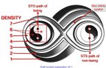
7: Take one half of the symbol, count the two horns, then the line of the infinity symbol, then the circle around the yin-yang symbol, the space between that circile and the yin-yang symbol, and you have 7 elements. So, the outside horns represent 1st and 2nd density; the infinity symbol represents 3rd density, the crossroads, the circle around the yin yang symbol represent 4 D, the empty space around the yin yang symbol, enclosed by the circle represents 5 D, and the yin-yang represents the two faces of 7 D, the thought centers of the ALL which are present on both sides: the matter and anti-matter universe. And, of course, the WHOLE thing is the ALL in toto.

Great job nicklebleu! I really like the simplicity of it. The only thing I would add is a circle around each of the ying yangs to represent 4th and 5th D as I assume the infinity symbol is suggested by the spaces between the ying yangs and the "horns". If that makes sense.
 
The engineer in me could not resist making an explanation diagram.
(Is it some kind of program in me?)
 

Attachments

  • LOGO_explanation003-sml.jpg
    LOGO_explanation003-sml.jpg
    110.6 KB · Views: 63
Back
Top Bottom